
Learn how to visualize data using a third-part library with custom reports. Create a pie chart report showing the average completion score of fact sheets of a specific type.
Overview
Maintaining the quality and completeness of your fact sheets is key to preserving the integrity and reliability of your data. The completion score attribute on fact sheets enables you to track the completeness of information. To learn more, see Fact Sheet Completeness.
In this tutorial, you'll learn how to create a pie chart report showing the average completion score of fact sheets of a specific type. To visualize the completion score, we'll use a third-party library.
To learn how to retrieve and filter fact sheet data, see the previous tutorials in this section.
Prerequisites
Before you start, do the following:
- Get admin access to your SAP LeanIX workspace.
- Obtain an API token by creating a technical user. For more information, see Technical Users.
- Create a project skeleton structure using the scaffolder of the LeanIX Reporting CLI. To learn more, see Setting Up Your Custom Reports Project.
This tutorial assumes you have basic knowledge of:
- JavaScript
- Reports in SAP LeanIX
Step 1: Navigate to the Project Directory
To get started, navigate to the directory of your project skeleton using the following command:
cd custom-reports-demo
Step 2: Create a Custom Report Module
Create a new JavaScript module named visualize.js in the src directory and insert the following code into it. This module exports the FactSheetCompletionReport class.
import "@leanix/reporting";
import Chart from 'chart.js/auto';

export class FactSheetCompletionReport {
  /**
   * Initializes the FactSheetCompletionReport class.
   * Fetches the Fact Sheets and GraphQL data, then renders the chart.
   * @param {Object} setup - The setup configuration.
   */
  constructor(setup) {
    this.setup = setup;
    this.factSheetTypes = [];
    this.selectedFactSheetType = null;
    this.averageCompletion = null;
    this.chart = null;
    this.registerChart();
    this.retrieveFactSheetInformation();
    this.fetchGraphQLData().then((data) => {
      this.renderChart();
    });
  }

  /**
   * Register a new chart using the reportCanvas element.
   */
    registerChart() {
      const canvas = document.getElementById('canvas').getContext('2d');
      this.chart = new Chart(
        canvas,
        {
          type: 'doughnut',
          options: {
            aspectRatio: 1,
            circumference: 180,
            rotation: -90,
            responsive: false,
            legend: {
              position: 'top',
            },
            title: {
              display: true,
              text: 'Average Completion for Fact Sheet Type'
            },
            animation: {
              animateScale: true,
              animateRotate: true
            }
          }
        }
      );
    }

  /**
   * Retrieves the Fact Sheets available in the workspace.
   * Sets the first Fact Sheet type as the default selection.
   * The `factSheetTypes` array contains the list of Fact Sheets.
   */
  retrieveFactSheetInformation() {
    this.factSheetTypes = Object.keys(this.setup.settings.dataModel.factSheets);
    this.selectedFactSheetType = this.factSheetTypes?.[0] || null;
  }

  /**
   * Creates a configuration object for the report, including menu actions.
   * @return {Object} The configuration object.
   */
  createConfig() {
    return {
      menuActions: {
        showConfigure: true,
        configureCallback: this.customReportModal.bind(this),
      },
    };
  }

  /**
   * Sets up the modal with a dropdown select field for the Fact Sheet types.
   * Fetches the GraphQL data and updates the average completion and chart.
   */
  async customReportModal() {
    const fields = {
      factSheetType: {
        type: "SingleSelect",
        label: "FactSheet Type",
        options: this.factSheetTypes.map((factSheetType) => ({
          value: factSheetType,
          label: lx.translateFactSheetType(factSheetType),
        })),
      },
    };
    const initialValues = { factSheetType: this.selectedFactSheetType };
    const values = await lx.openFormModal(fields, initialValues);
    if (values) this.selectedFactSheetType = values.factSheetType;
    const averageCompletion = await this.fetchGraphQLData();
    if (averageCompletion) this.averageCompletion = averageCompletion.toFixed(2);
    this.renderChart();
  }

  /**
   * Renders the chart with the average completion data.
   * Clears existing content, formats the output, and creates a new Chart.js doughnut chart.
   */
  renderChart() {
    // Clear existing content
    const factSheetLabel = document.getElementById('fact-sheet-type-label')
    factSheetLabel.innerHTML = this.selectedFactSheetType;
    const chartLegend = document.getElementById('chart-legend');
    // Format the output
    chartLegend.innerHTML = `${this.averageCompletion}%`;

    // Update the chart
    this.chart.data.labels = ['Average Completion']
    this.chart.data.datasets = [{
      label: 'Average Completion for Fact Sheet Type',
      data: [this.averageCompletion, 100 - this.averageCompletion],
      backgroundColor: ['rgba(75, 192, 192, 0.6)', 'rgba(0, 0, 0, 0.1)'],
      borderColor: ['rgba(75, 192, 192, 1)', 'rgba(0, 0, 0, 0.1)'],
      borderWidth: 1
    }];
    this.chart.update();
  }

  /**
   * Method that queries the workspace for the completion value of the selectedFactSheetType.
   */
  async fetchGraphQLData() {
    const query =
      "query($factSheetType:FactSheetType){allFactSheets(factSheetType:$factSheetType){edges{node{completion{completion}}}}}";
    try {
      lx.showSpinner();
      this.averageCompletion = await lx
        .executeGraphQL(query, { factSheetType: this.selectedFactSheetType })
        .then(({ allFactSheets }) => {
          const completionSum = allFactSheets.edges.reduce(
            (accumulator, { node }) =>
              (accumulator += node.completion.completion),
            0
          );
          const factSheetCount = allFactSheets.edges.length;
          const averageCompletion = completionSum
            ? (completionSum / factSheetCount) * 100
            : 0;
          return averageCompletion.toFixed(2);
        });
      } catch (error) {
        console.error('Error executing GraphQL query:', error);
      } finally {
        lx.hideSpinner();
    }
  }
}
Step 3: Import Facets into the Main Module
Open the generated index.js file of your project skeleton and replace the code with the following:
// Importing '@leanix/reporting' makes the `lx` object globally available.
import '@leanix/reporting';
// Import CSS assets for the custom report.
import './assets/main.css';
// Import our custom report module.
import { FactSheetCompletionReport } from './visualize.js'

/**
 * Initialize the LeanIX reporting framework and create the report.
 *
 * The `lx.init()` method signals the reporting framework to begin report initialization.
 * It returns a promise, which gets resolved once the initialization process is complete.
 */
lx.init().then((setup) => {
  // Once initialization completes, we receive a `setup` object with LeanIX
  // data for our report. Next, we construct the report object and configure it.
  const report = new FactSheetCompletionReport(setup);
  const config = report.createConfig();

  // Pass the finalized configuration object to `lx.ready()` function,
  // notifying LeanIX that our report is prepared to receive and process data.
  lx.ready(config);
});
Step 4: Update HTML Content
To ensure that the pie chart report is rendered properly, incorporate additional HTML elements into the structure of your custom reports project. To do that, open the index.html file within your project directory and replace the pregenerated HTML content with the following:
<!DOCTYPE html>
<html>
  <head>
    <meta charset="utf-8" />
    <meta name="viewport" content="width=device-width, initial-scale=1" />

    <meta name="application-name" content="LeanIX Custom Report Demo" />
    <meta name="description" content="This is a custom reports demo" />
    <meta name="author" content="LeanIX" />
    <title>Fact Sheet Average Completion</title>
  </head>
  <body>
    <div class="container mx-auto text-md text-gray-800">
      <!-- chart container -->
      <div class="relative flex flex-col flex-wrap items-center mt-16 -mx-8 mt-16">
        <!-- chart title -->
        <div class="text-xl mb-2">Average Completion Ratio for Fact Sheet Type</div>
        <!-- chart subtitle -->
        <div class="text-xl font-bold" id="fact-sheet-type-label">
        </div>
        <!-- chart legend -->
        <div class="absolute bottom-12 font-bold text-xl" id="chart-legend">
        </div>
        <!-- canvas container -->
        <div>
          <canvas id="canvas" ref="chartCanvas"/>
        </div>
      </div>
    </div>
  </body>
</html>
Step 5: Start the Development Server
Once you've updated HTML content, you can start the development server. Run the following command:
npm start
A new tab opens in your browser displaying your custom report in the Reports section within your SAP LeanIX environment. If the tab doesn't open, the command provides a link that you can copy and then paste into the address bar of your browser.
The following image shows the outcome of the script used in this tutorial.
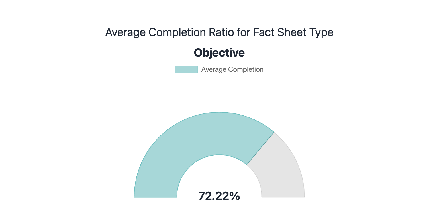
Custom Report That Shows the Average Completion Score for Fact Sheets of the Objective Type
Summary
This tutorial provided detailed guidance on how to create a custom pie chart report showing the average completion score of fact sheets of a specific type. You learned how to:
- Use the lx.openFormModal method to create and manage custom modals within the LeanIX Reporting Framework
- Use the lx.executeGraphQL method to retrieve your workspace data through the GraphQL API
- Calculate the average completion score of fact sheets of a specific type, which is a critical aspect of maintaining high data quality in your workspace
- Visualize workspace data using a third-party library