Integration Architecture
This section gives you an overview of modeling reports used for handling your Integration Architecture. It tells which are the standard reports and how to import the right data to get meaningful analysis.
Integration architecture is another major part of every company's IT landscape. This tutorial shows how to get started with Interface Management in LeanIX, and how to combine the Interface Circle Map and the Data Flow to get both high-level and deep-dive views of it.
Please make sure to read our documentation on how to import data as well, if you didn't have yet: Import and Export your Data
Import your Interfaces
An Interface in LeanIX has the following core relations and attributes:
- An Interface Provider (Application): The providing Application offers the Interface (e.g. in case of a REST API). Hence, changes and responsibilities of the Interface are often closely connected to the Provider. Be aware that there must only be one Provider for each Interface.
- One or more Interface Consumer (Application): The consuming Applications use the provided interface, and are hence affected by changes or outages
- One or more Data Objects: The concept here is, that the interface exchange business-level Data Object, e.g. Customer or Account
- One or more IT Components: To represent what's required technically to run the interface, e.g. an ESB or a certain technology
- Interface-specific attributes: In particular, the data flow lets you define how data is exchanged. Note that this question is independent from the Provider / Consumer concept: If an application like LeanIX offers a read API, the direction is outgoing, while in case of a write API, it's incoming. Still in both cases, LeanIX is the Provider.
Best Practice
Learn more about Interface modeling.
Assuming that the related Fact Sheets have been created already, the interfaces can easily be imported via XLS as follows:
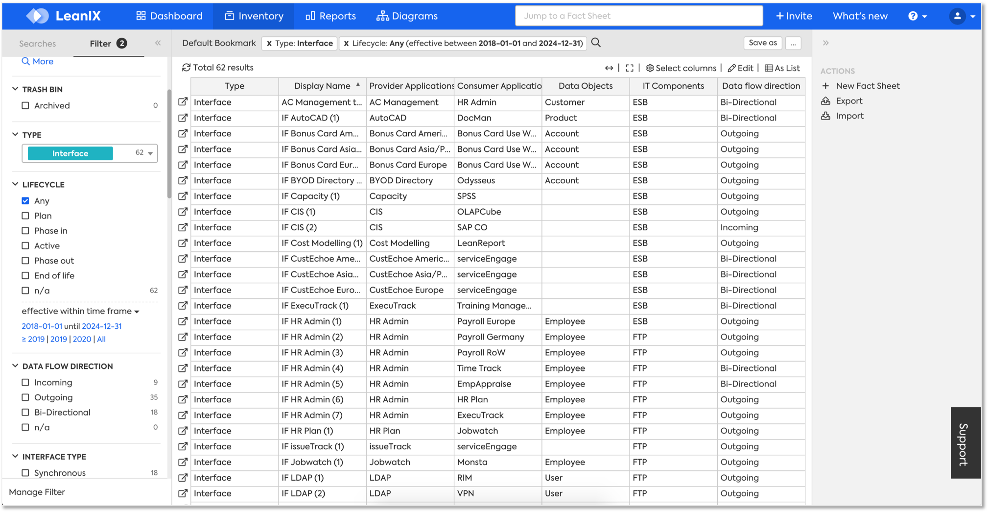
Use the Interface Circle Map to get a high-level overview
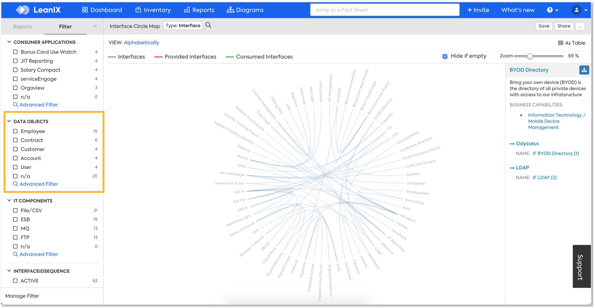
The Interface Circle Map gives you a nice overview of the complexity and lets you identify interface-clusters. It is most powerful when used with individual filters, see Insights through Reports
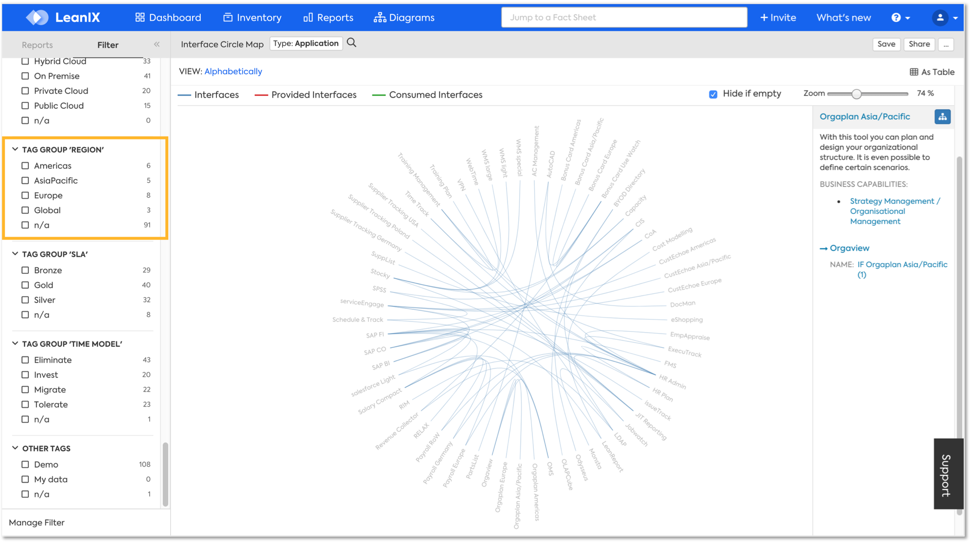
There are two major use cases for filtering:
a) Filter by Interface attributes or relations, e.g. by a certain Data Object
b) Filter by Application attributes or relation, e.g. by a certain User Group (e.g. Region)
Dive into Details - Data Flow Diagram
After filtering, use the mouse to hover over the applications. It will show you consumed interfaces in green and provided interfaces in red. Also, on the right hand side you see details about the selected application, in particular the description, the business capabilities and some details of the interfaces:
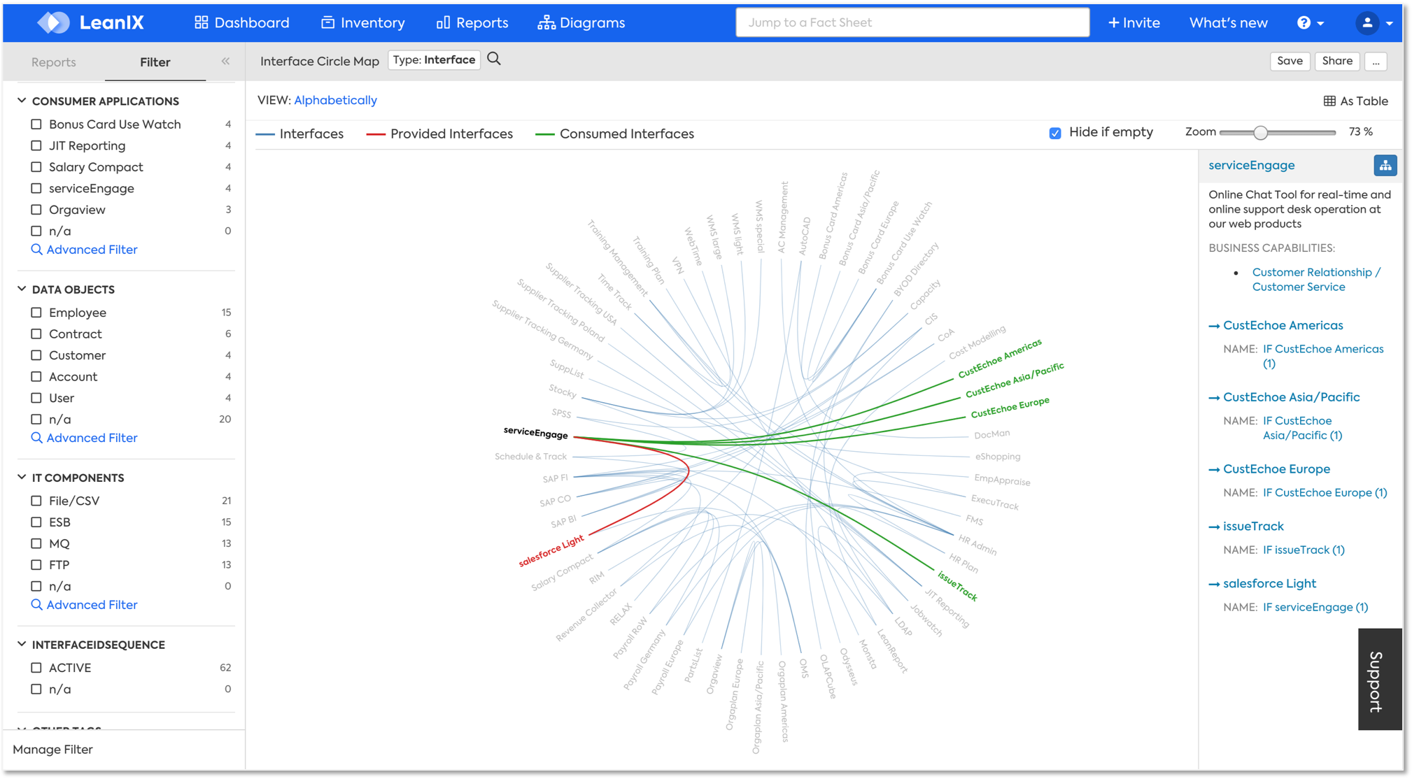
The blue button on the top right allows you to jump directly to the data flow. The data flow will start with the selected application and its interfaces:
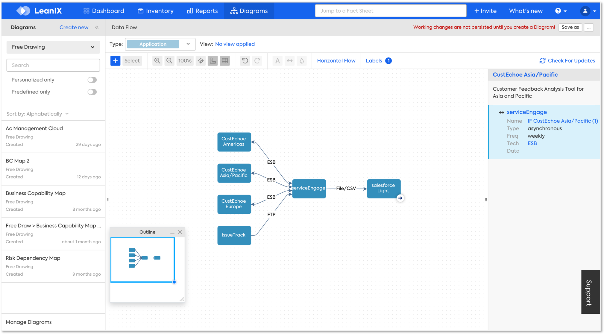
Use the data flow to create your individual ad-hoc detailed view
Now, the data flow allows you to include more interfaces, change the labels or layout, or add additional elements like boxes within a few minutes:
- Add more interfaces: The small arrows lets you expand the shown applications:
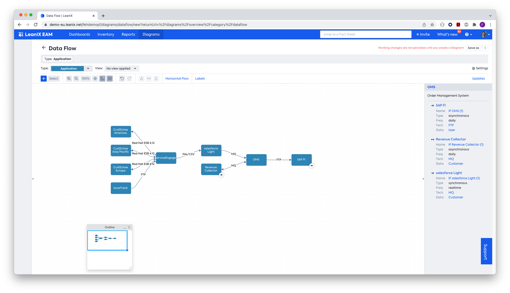
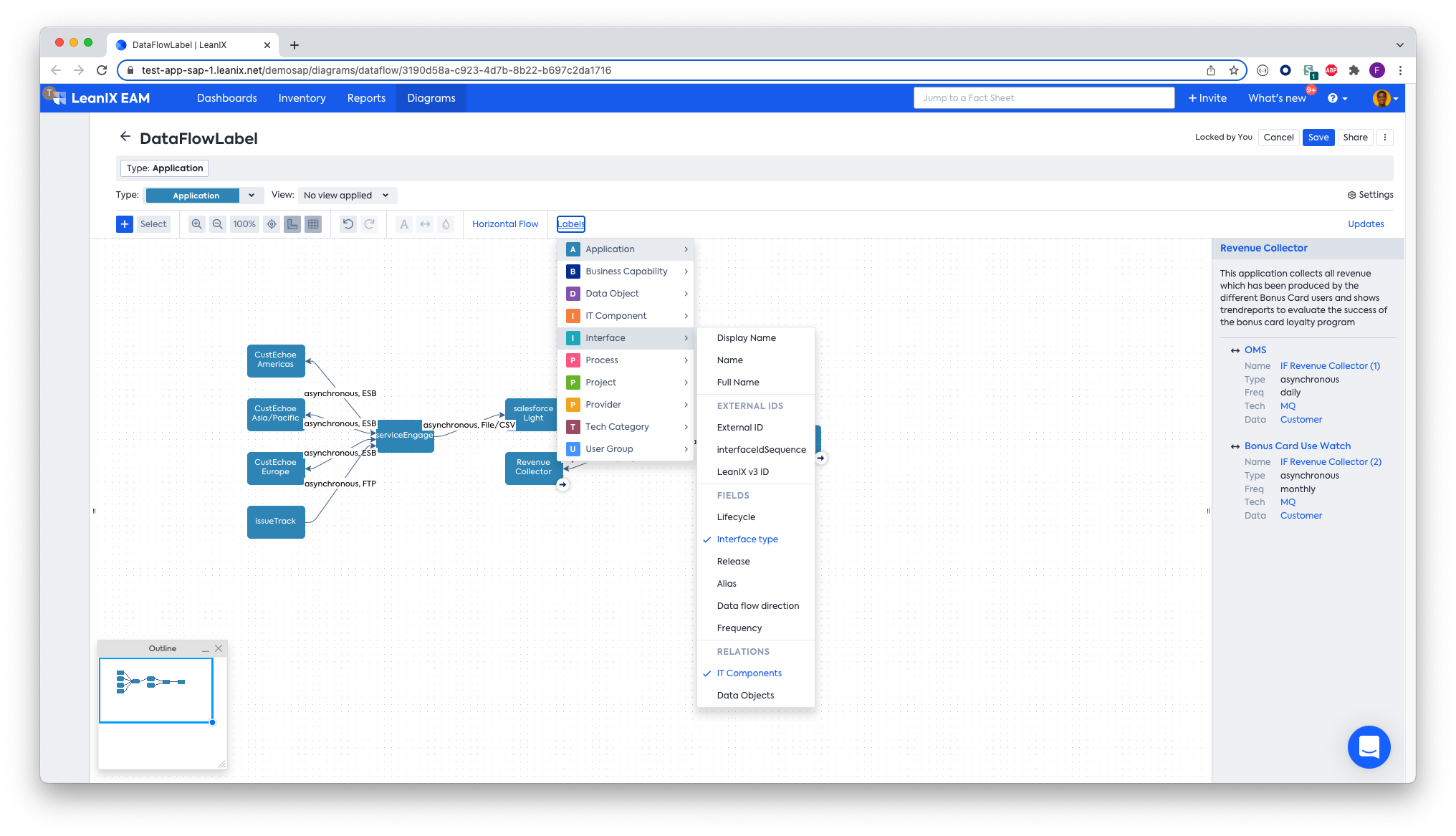
- Use the "Labels" button to decide, what information to show on the edges. On the Interface Fact Sheet type, users can choose between any custom fields, external identifiers or the relations to the IT Component or Data Object.
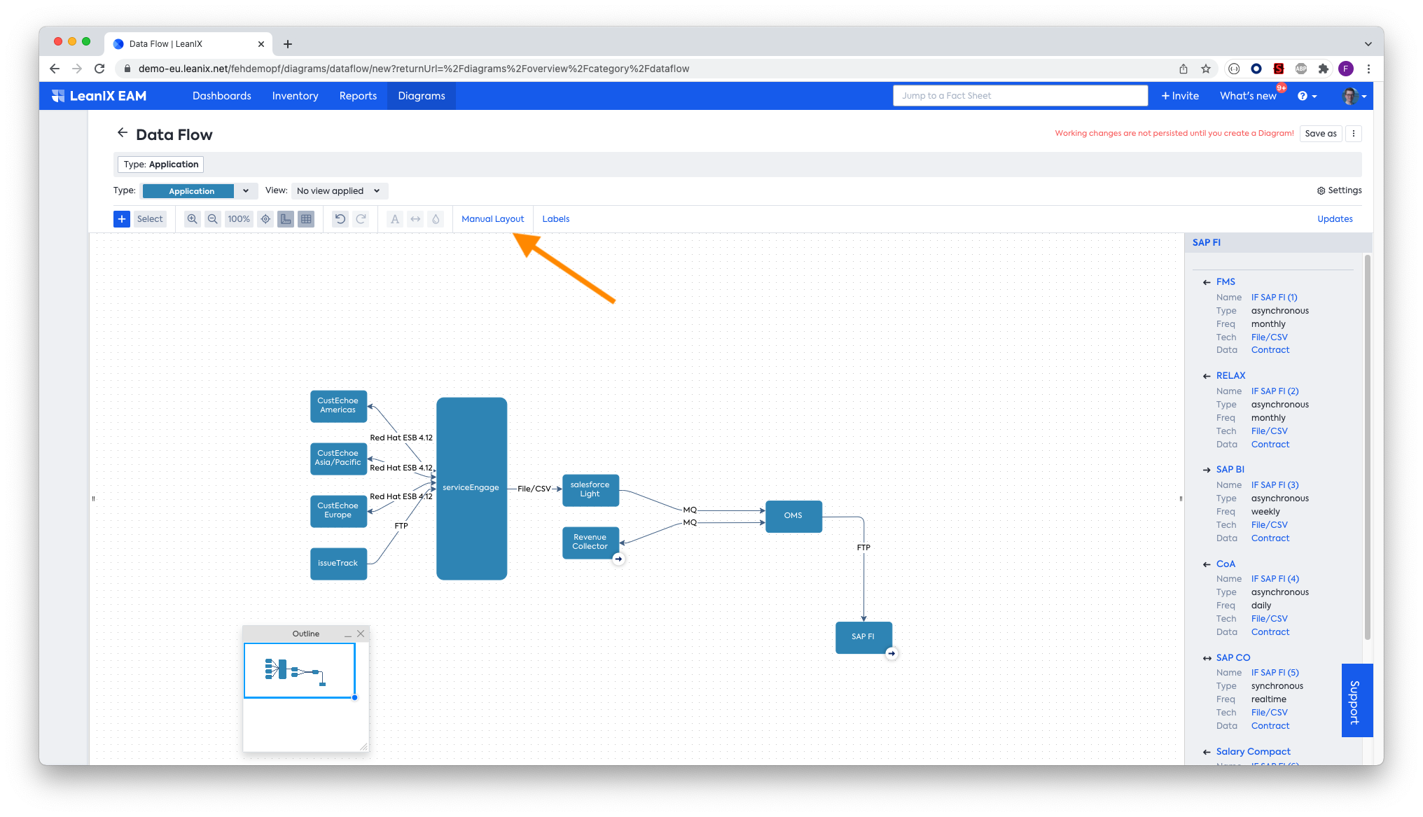
- Use the layout button as indicated by the arrow to switch to vertical view, or even to manual layout to rearrange the boxes as you require:
- Expand the menu on the left by pulling it as indicated by the arrow to include elements like boxes:
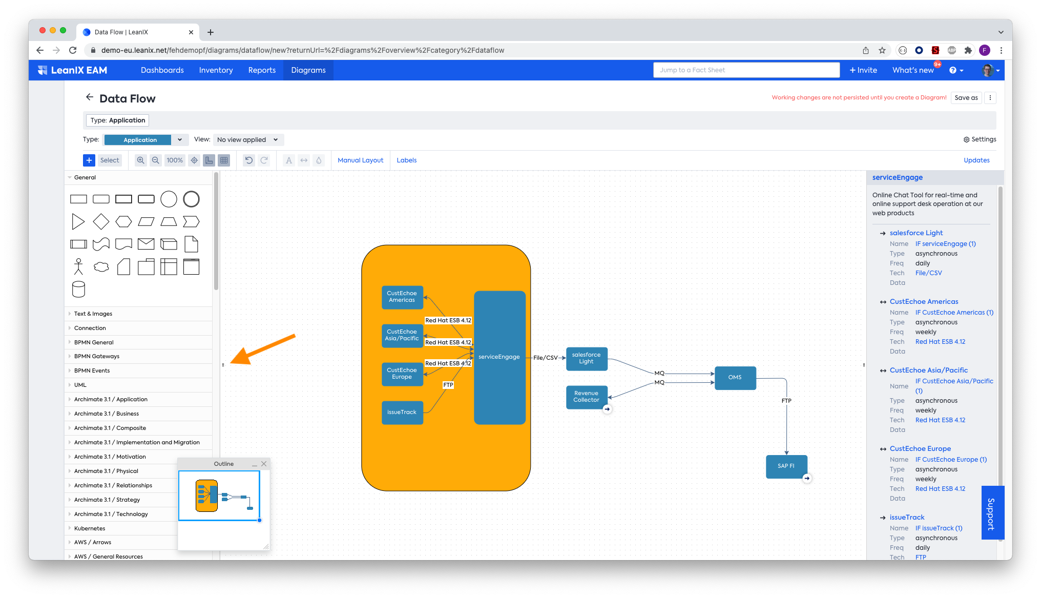
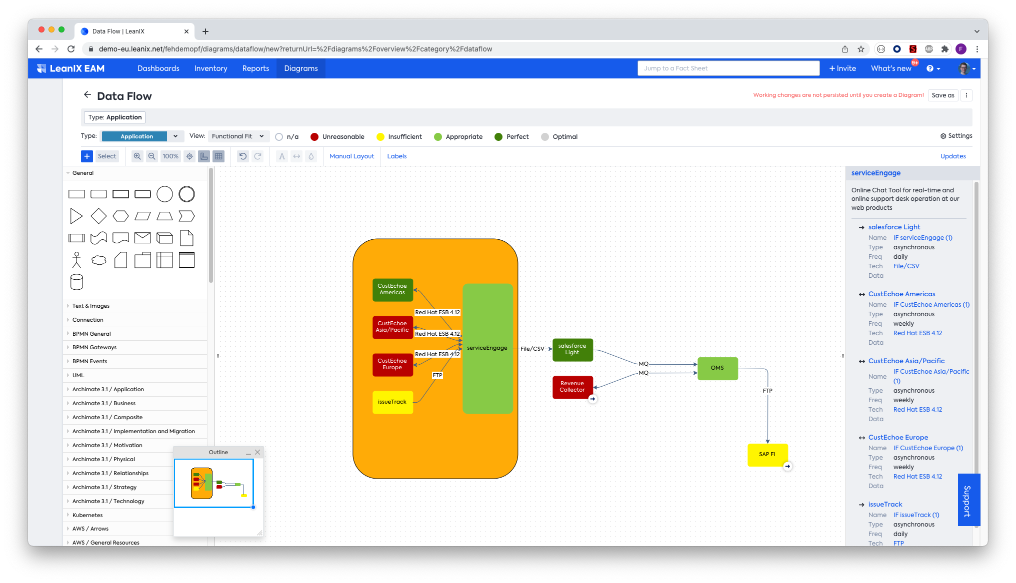
- Apply meaningful colors to the applications:
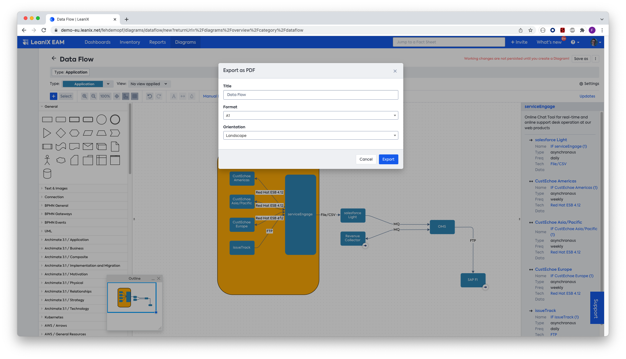
- Finally, save or export the report to share it with others:
Updated over 1 year ago
