
Portfolio Report
The SAP LeanIX Portfolio Report groups Applications, Projects, or Providers based on specific attributes such as functional and technical suitability. This report is based on Gartner TIME assessment and can be beneficial in identifying areas that require attention. It is one of the most popular SAP LeanIX reports, supporting use cases like Application Portfolio Assessment and Application Rationalization.
The portfolio report is configurable and can be set to any of the factsheet types present in the workspace data model, for e.g., Application Portfolio and Provider Portfolio Report. This article focuses on the Application Portfolio Report which allows users to add filters and switch between different views to drill down and find for e.g., active applications that are business critical but have an insufficient technical fit.
The Portfolio Report offers a high-level summary or big picture of an organization’s portfolio state to support decision-making in discussions between the EA and stakeholders from the business.
Application Portfolio report
How is it useful?
This report is particularly useful for IT leaders and stakeholders who need to understand the overall health and performance of their organization's IT assets. Portfolio Reports are useful for several reasons:
- High-level Overview: It provides a high-level overview of the IT portfolio, business capabilities, application performance, technical debt, and risk analysis.
- Rationalization and optimization: The report helps in identifying redundant applications, retiring outdated systems, and reducing complexity and cost.
- Risk management: It helps spot applications with the unreasonable functional and technical fit and hence help
- Alignment: The report assists in bringing IT and business objectives in harmony. It can help you identify Providers that need to be replaced or renewed based on the Criticality and Quality of service provided
Using the Portfolio Reports
The Portfolio report is configurable and can be set to any of the factsheet types present in the workspace data model. Usually, you will see a few default Portfolio reports as set by your admin, such as:
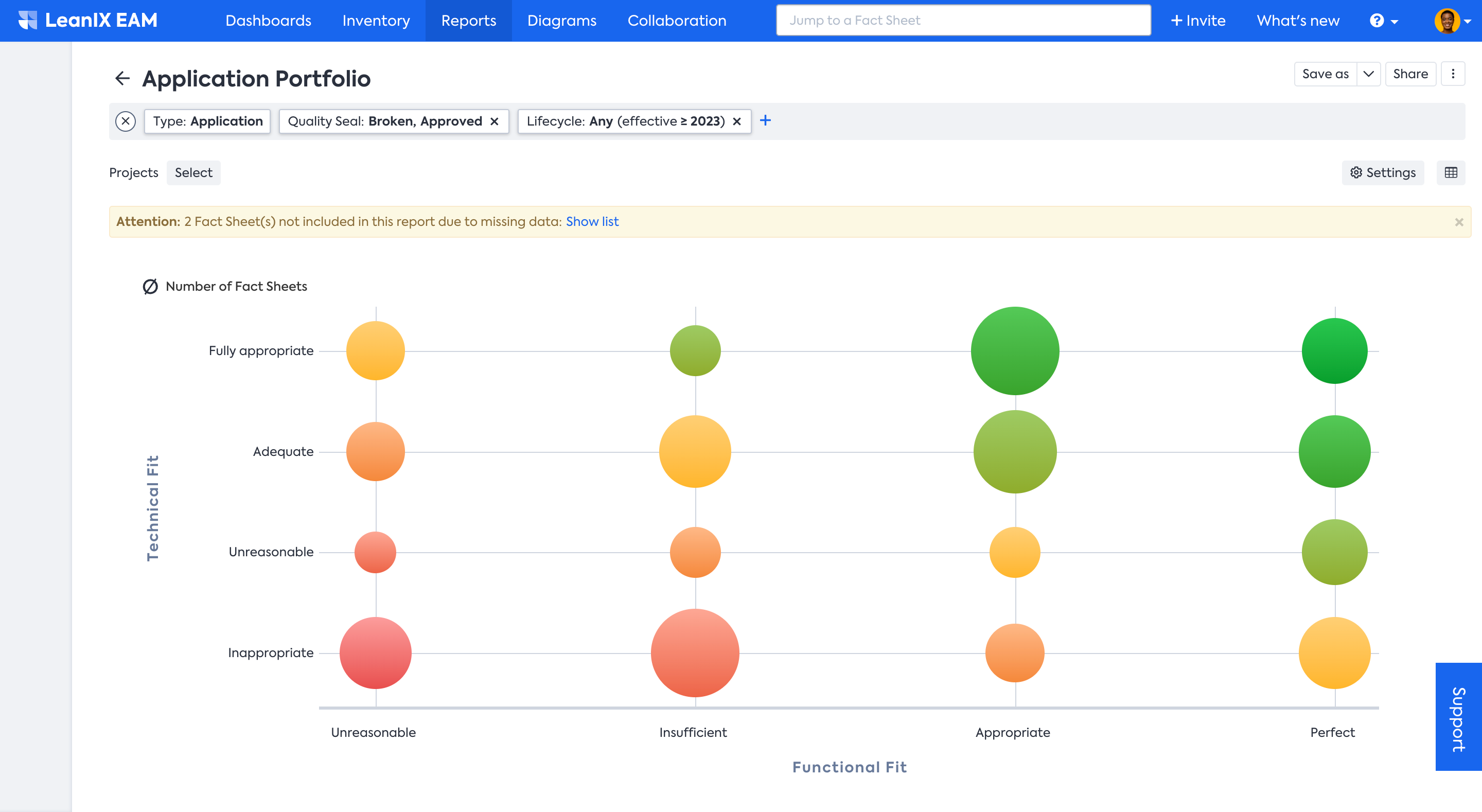
- Application Portfolio report helps you look at your portfolio through the dimension of Technical fit vs Functional fit. For example, 'Active' Applications that are Business Critical but have insufficient Technical Fit.
- Provider Portfolio Report groups Providers according to their 'Criticality' and 'Quality'. It can help you identify Providers that need to be replaced or renewed.
- The Project Portfolio Report groups Projects according to their Value and Risk. For example, it can help you identify Projects in a specific User Group or Business Unit that have high Business Value but have a Severe Risk.
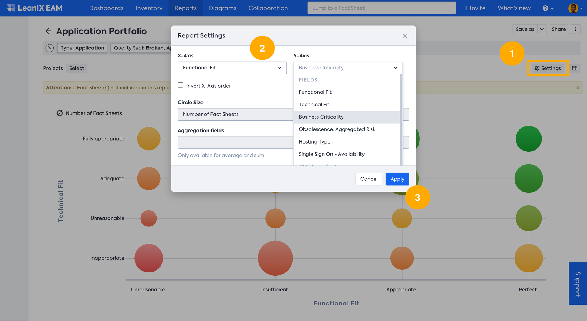
You can customize the reports by changing the X- and Y-Axis parameters through the Report Settings. For instance, you want to review your application portfolio at the intersection of Functional Fit and Business Criticality. To do so, click on Settings in the right top corner and select the X- and Y-Axis parameters from the drop-down menu, and click apply to see the newly generated report.
This view is particularly helpful for finding business- and mission-critical applications that do not functionally derail your business requirements. So this report provides powerful insights into the potential decommission and investment opportunity within your portfolio.
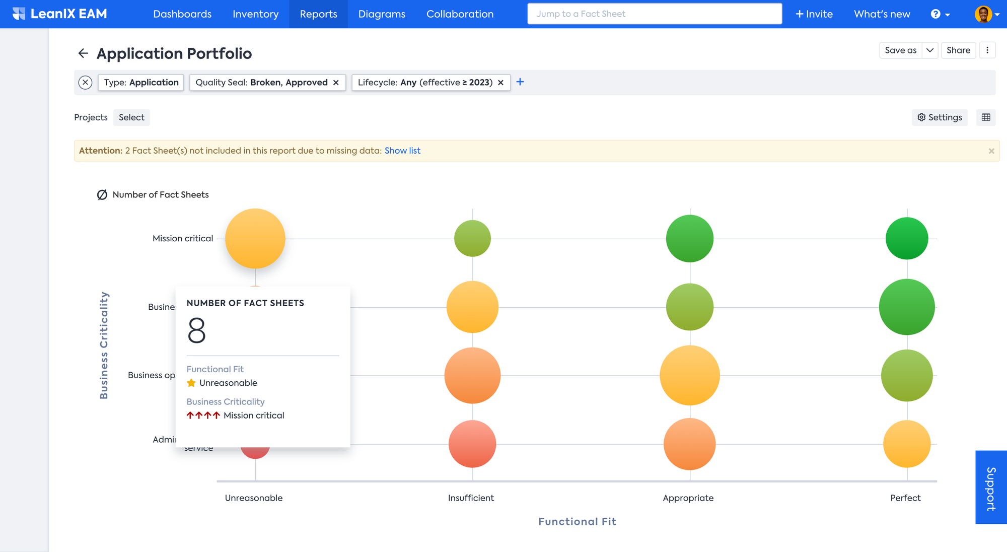
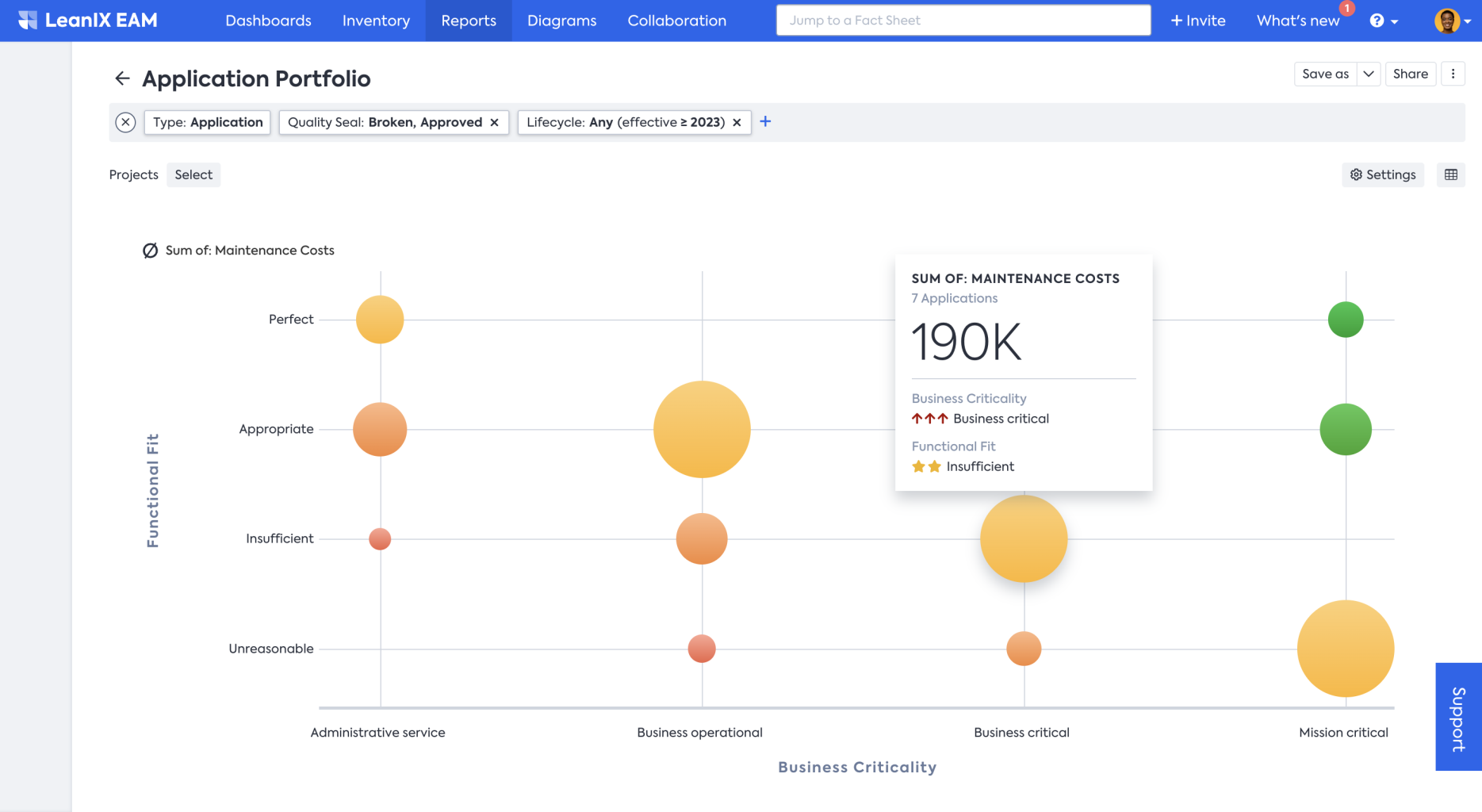
In the report, you can hover over the bubble to see a quick summary of the number of Fact Sheets represented by that bubble and the classification of the bubble according to the chosen dimensions.
Further, you can change the settings to make the circle size represent cost, which allows you to quickly analyze the cost details.
Adjust the report using the following steps:
- Click on Settings, to open the Report Settings menu. From the Circle Size drop-down menu, select Sum of: Aggregation fields and click apply.
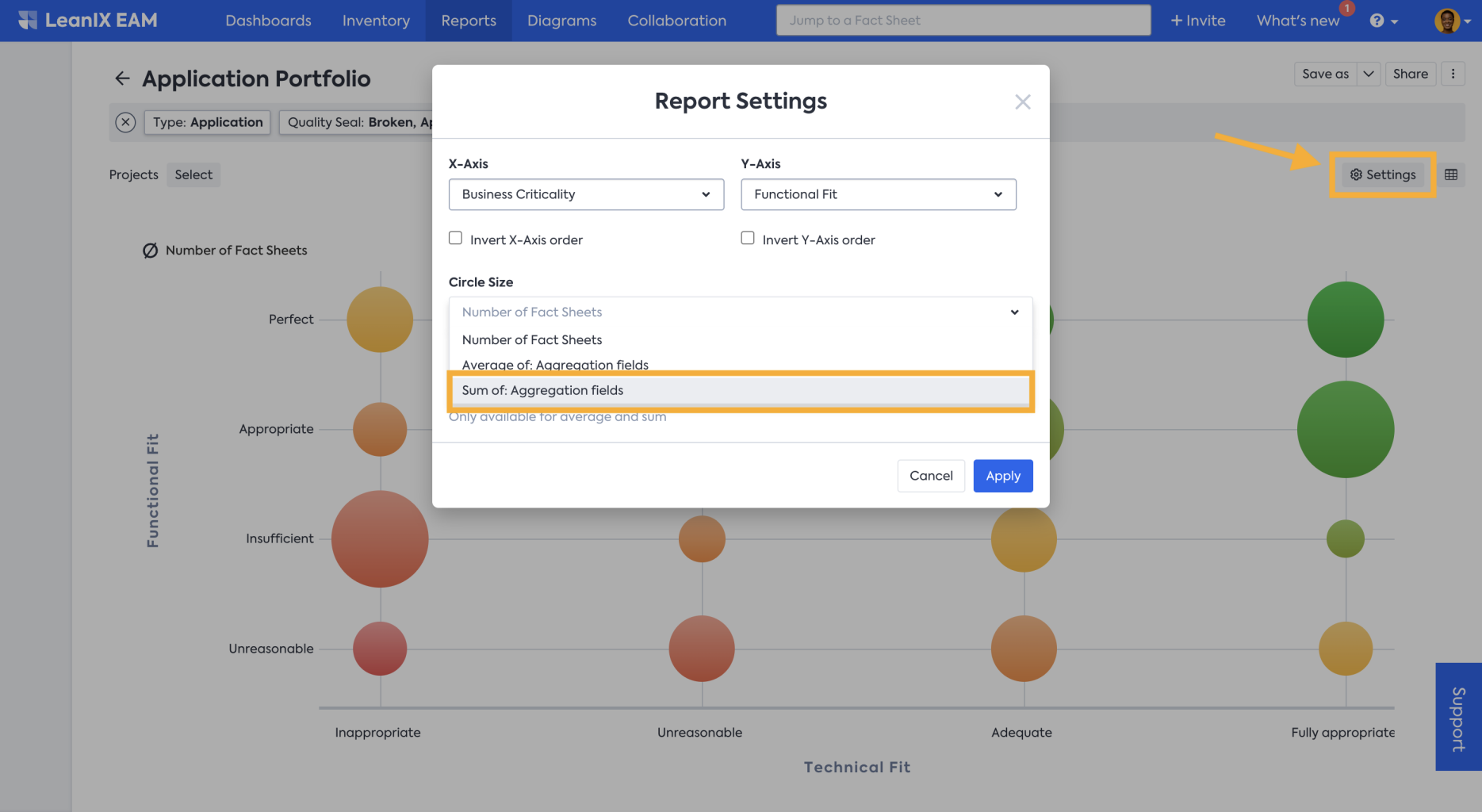
- From the Aggregation fields drop-down menu in this example Maintenance Costs (a custom field) is selected. But depending on your needs, you can define and select other attributes.
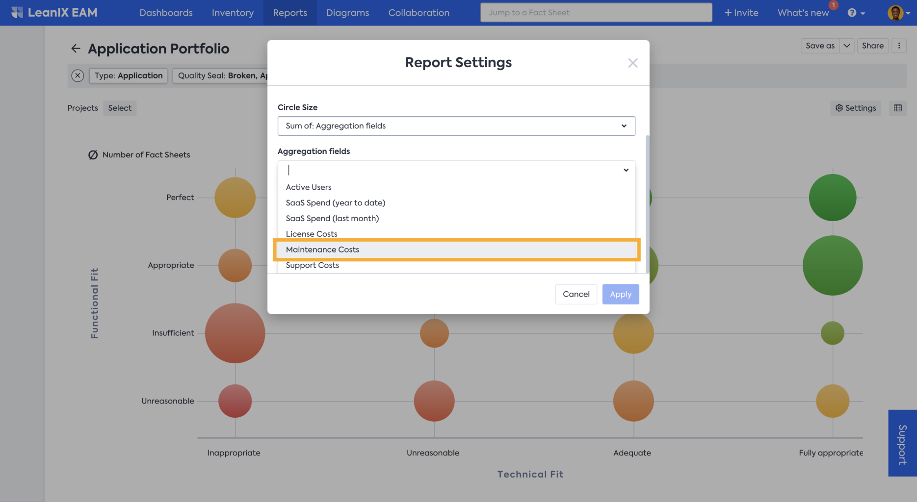
- Now the circle size represents the maintenance cost of those grouped applications, and when you hover over the circle, you can see the summary details in the floating panel.
Editing in the Report
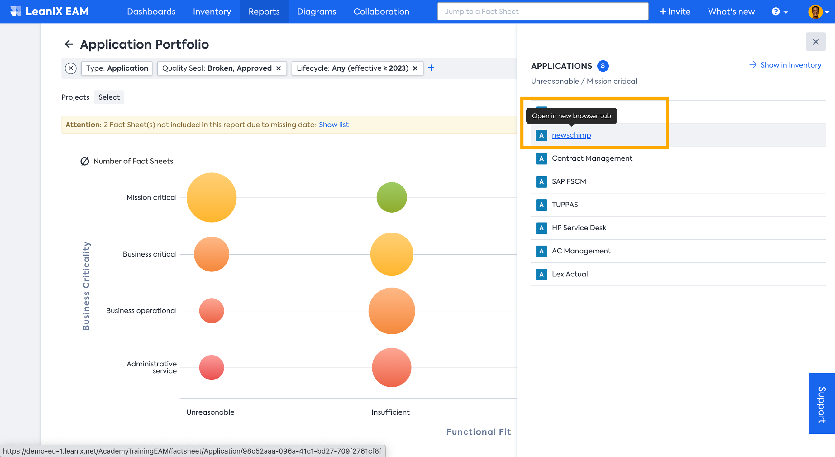
By clicking on the bubble, you will be able to get the list of all the Fact Sheets grouped under the bubble. You can also go directly to the Fact Sheet of interest by clicking on the Fact Sheet name.
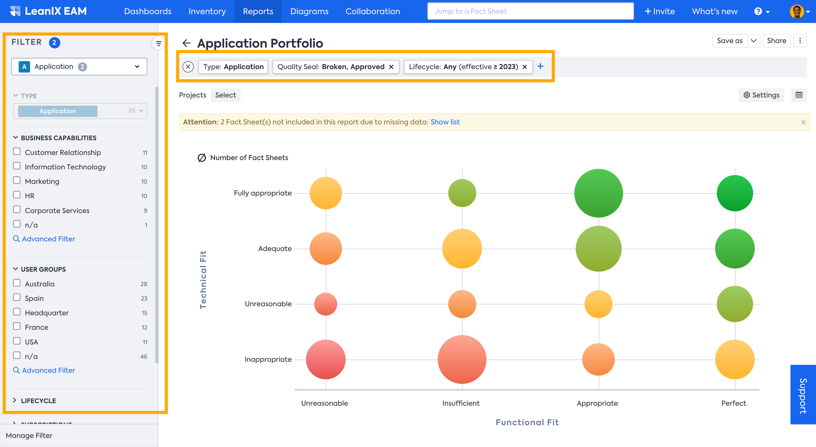
Applying Filter
You can further apply various filters to drill down and get the information you need. To apply the filter you can use both the filter bar on top or filter facets on the left-hand side which becomes visible when you move the mouse pointer to the left side of the window.
Updated 3 months ago