
Step 4. Evaluate Data
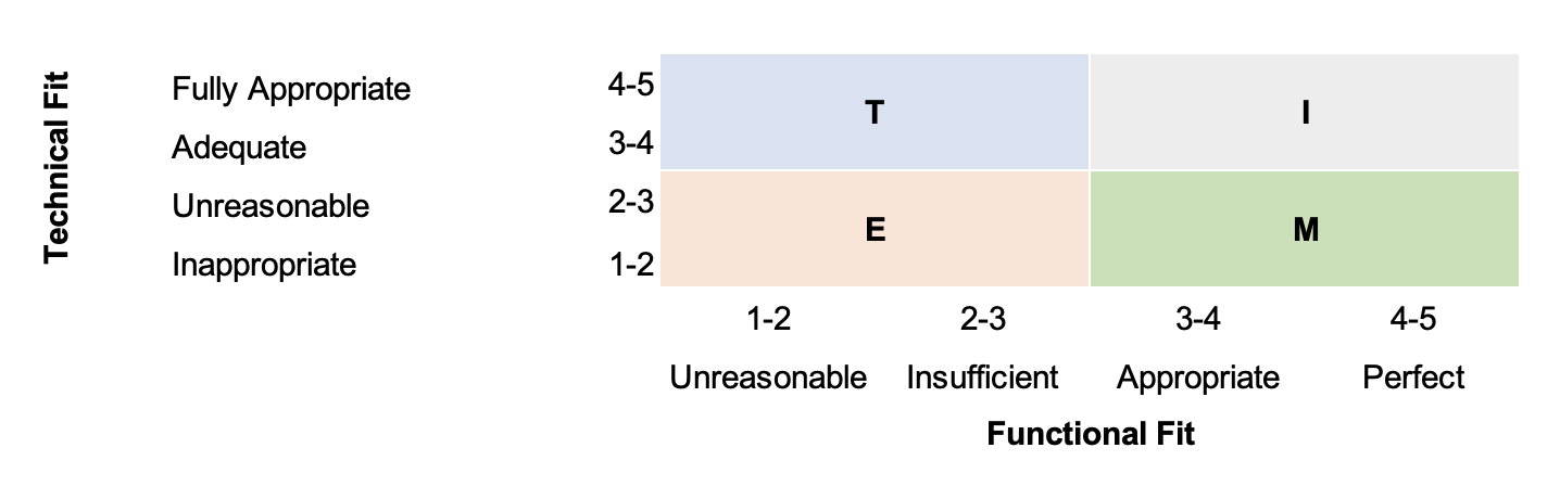
Now you want to evaluate the data you can find in your Application Fact Sheets. You can do that by scanning them manually and making decisions for each application. See the following illustration on how to determine the right TIME classification for your application based on the Functional and Technical Fit.
Information
SAP LeanIX Professional Services offers a way to automate this process for you. The custom TIME algorithm allows you to determine Functional and Technical Fit in an objective and criteria-based way. SAP LeanIX can give you automated recommendations to make it easier to choose the most suitable TIME classification per application. This way, you can leverage the TIME scoring as a conversation starter with your stakeholders because everyone needs to argue for and against specific options.
Information
Before starting to evaluate the data, ensure to have the following in place:
- Application scope (see step 2)
- Baseline information (description, subscriber, relation to IT components, etc) per application (see step 2)
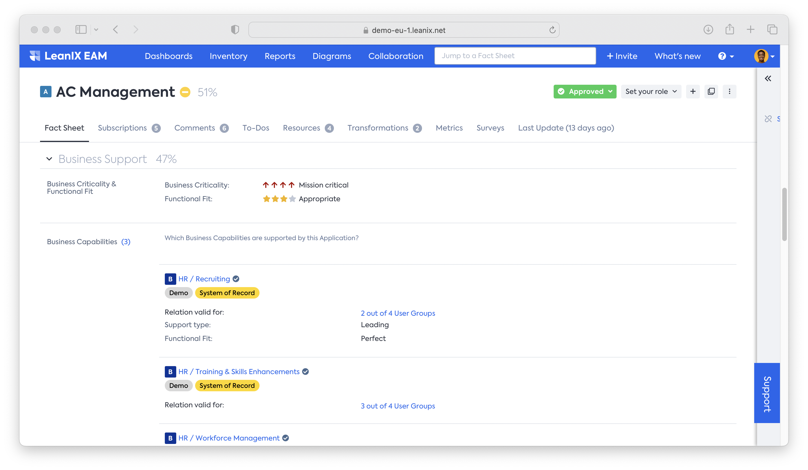
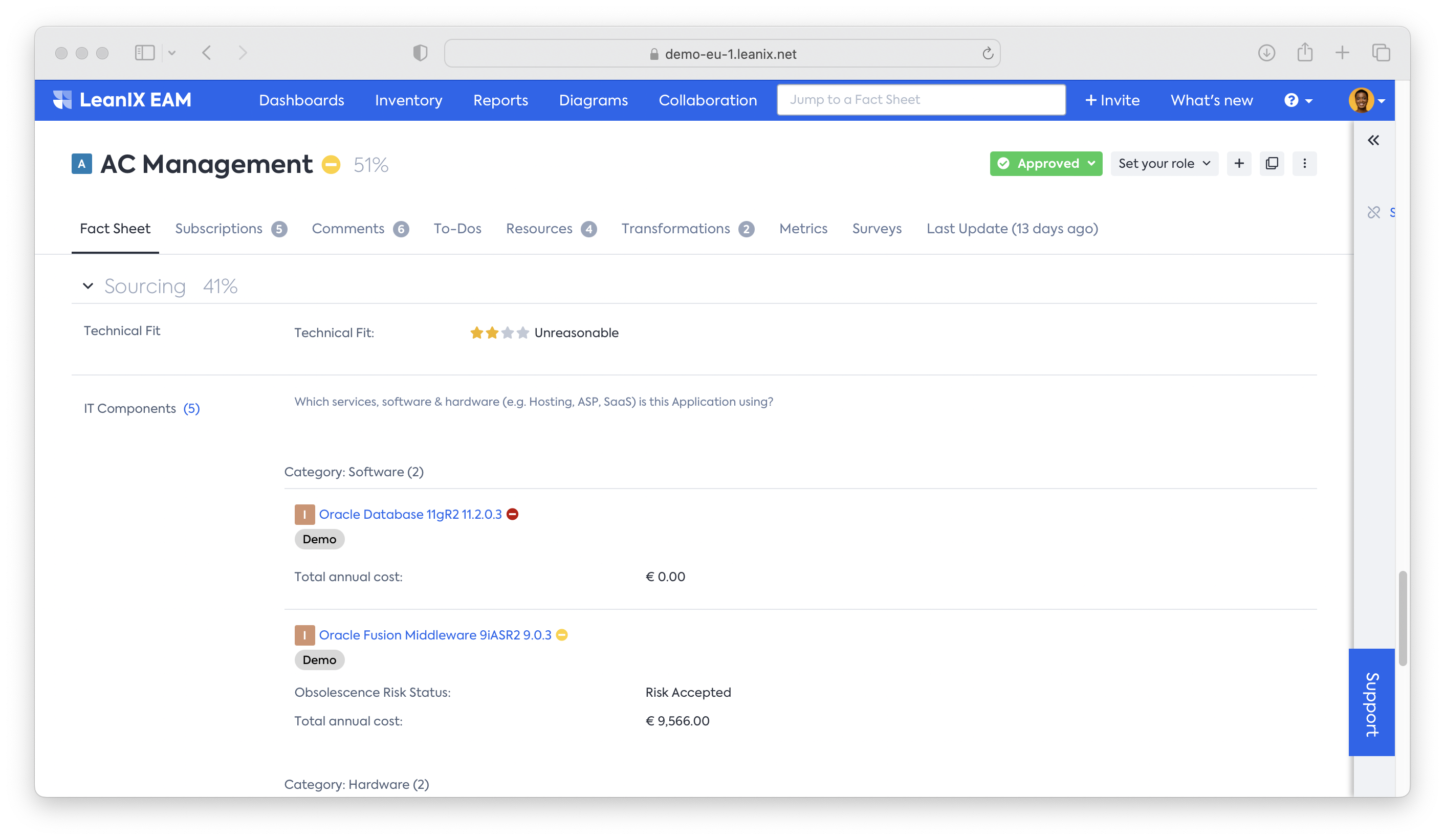
- Information on Functional and Technical Fit for each application in scope
- Cost information on the relation between application and IT components
We recommend that the final decision on how to deal with the application is not made solely on the basis of the initial semi-automated assessment. Once this is completed, gather different stakeholders (refer back to your initial stakeholder assessment) to make a final decision on the application.
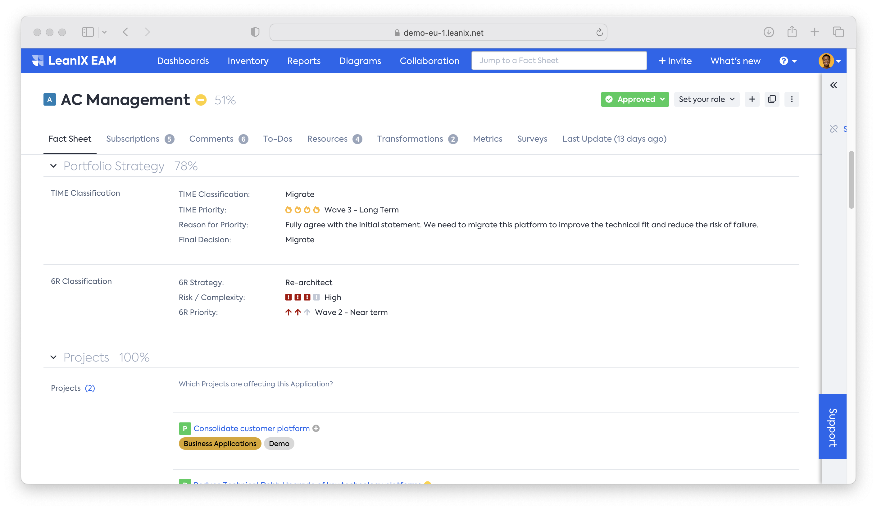
- Depict the TIME classification per application and update the information accordingly. The following are some examples of how to do it:
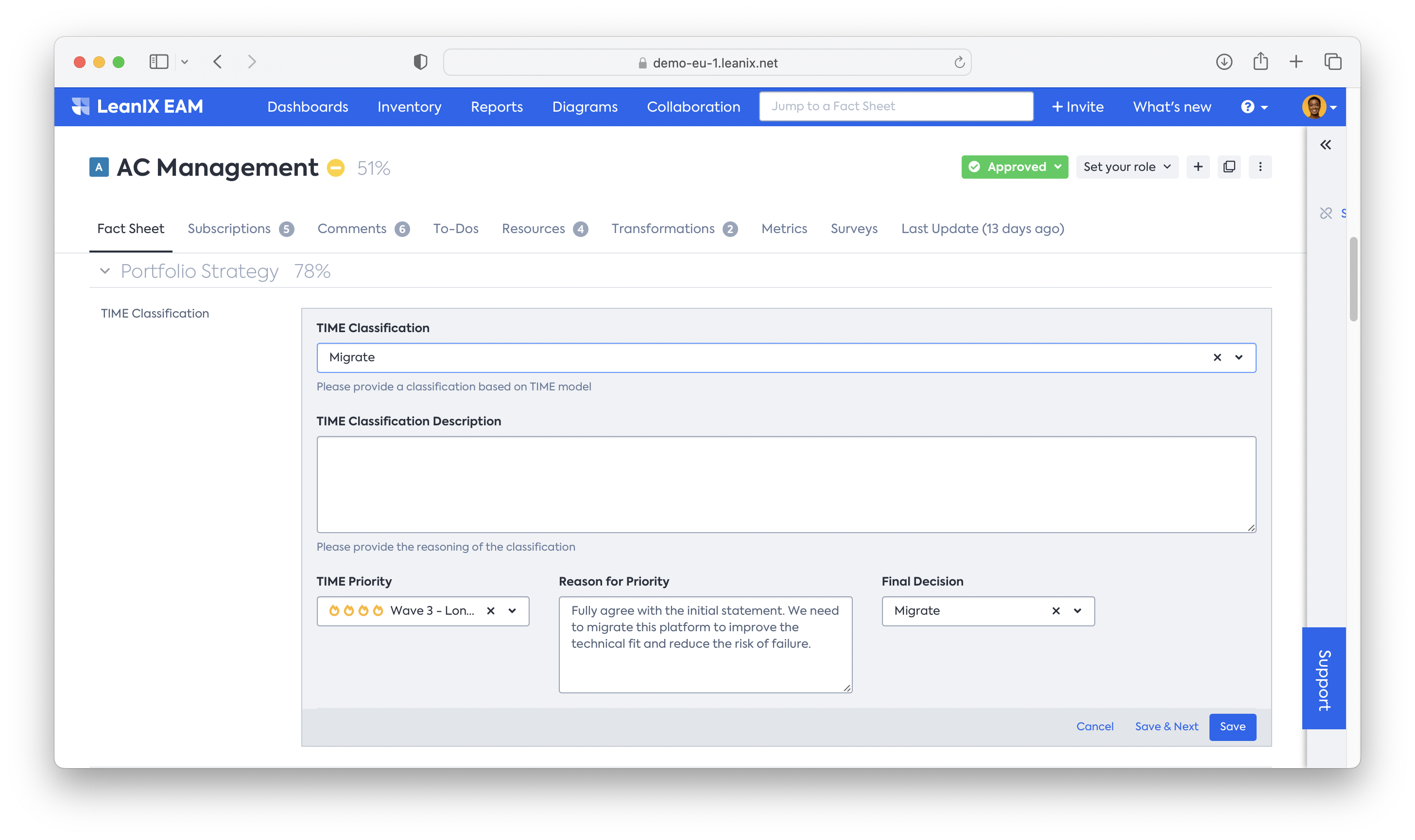
a. AC management: Functional Fit = 4, Technical Fit 2 → TIME: migrate
b. AutoCAD: Functional Fit = 2, Technical Fit = 1 → TIME: eliminate
- Based on your initial stakeholder assessment, organize decision meetings to finalize the TIME classification per application
Obtain insights through Reports.
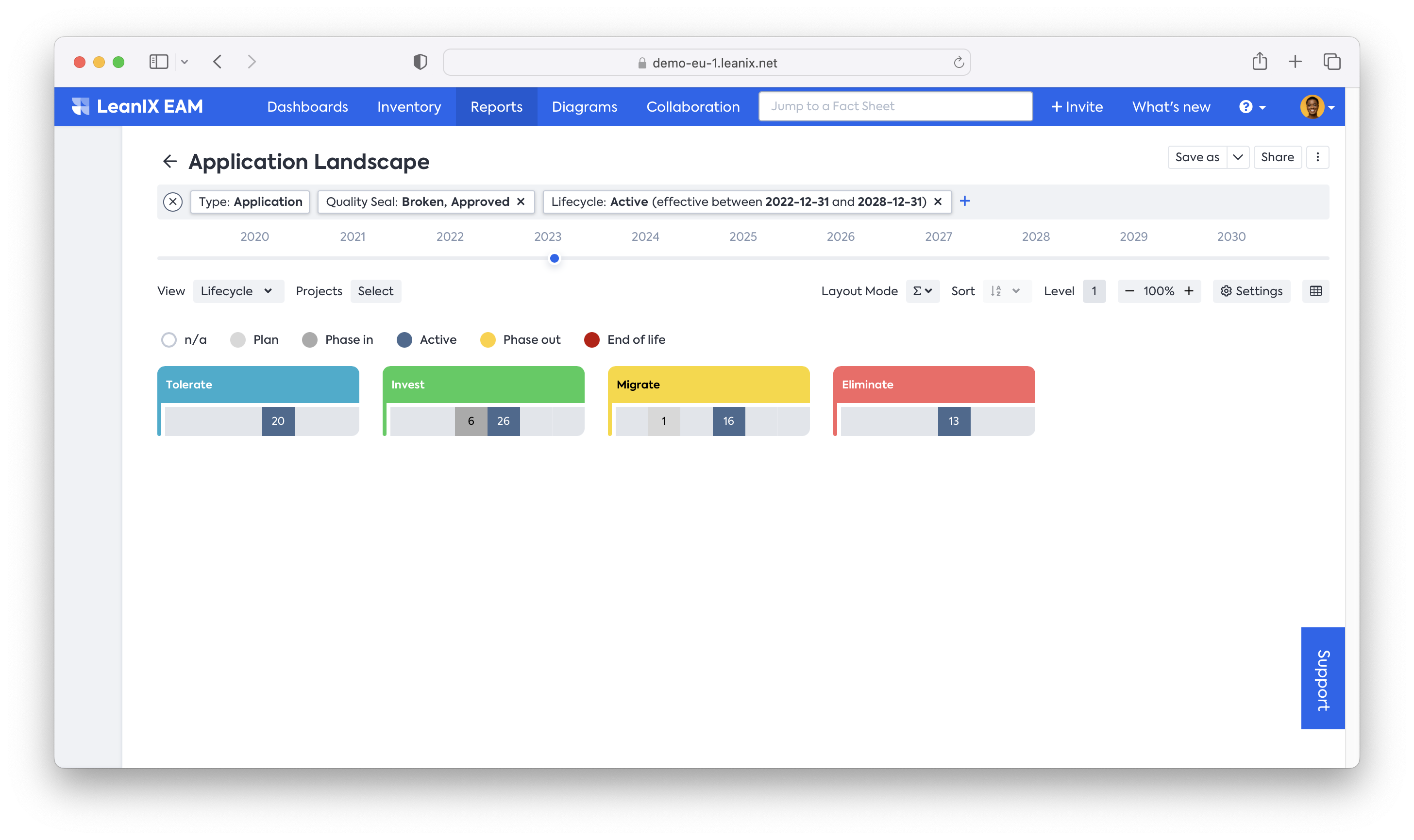
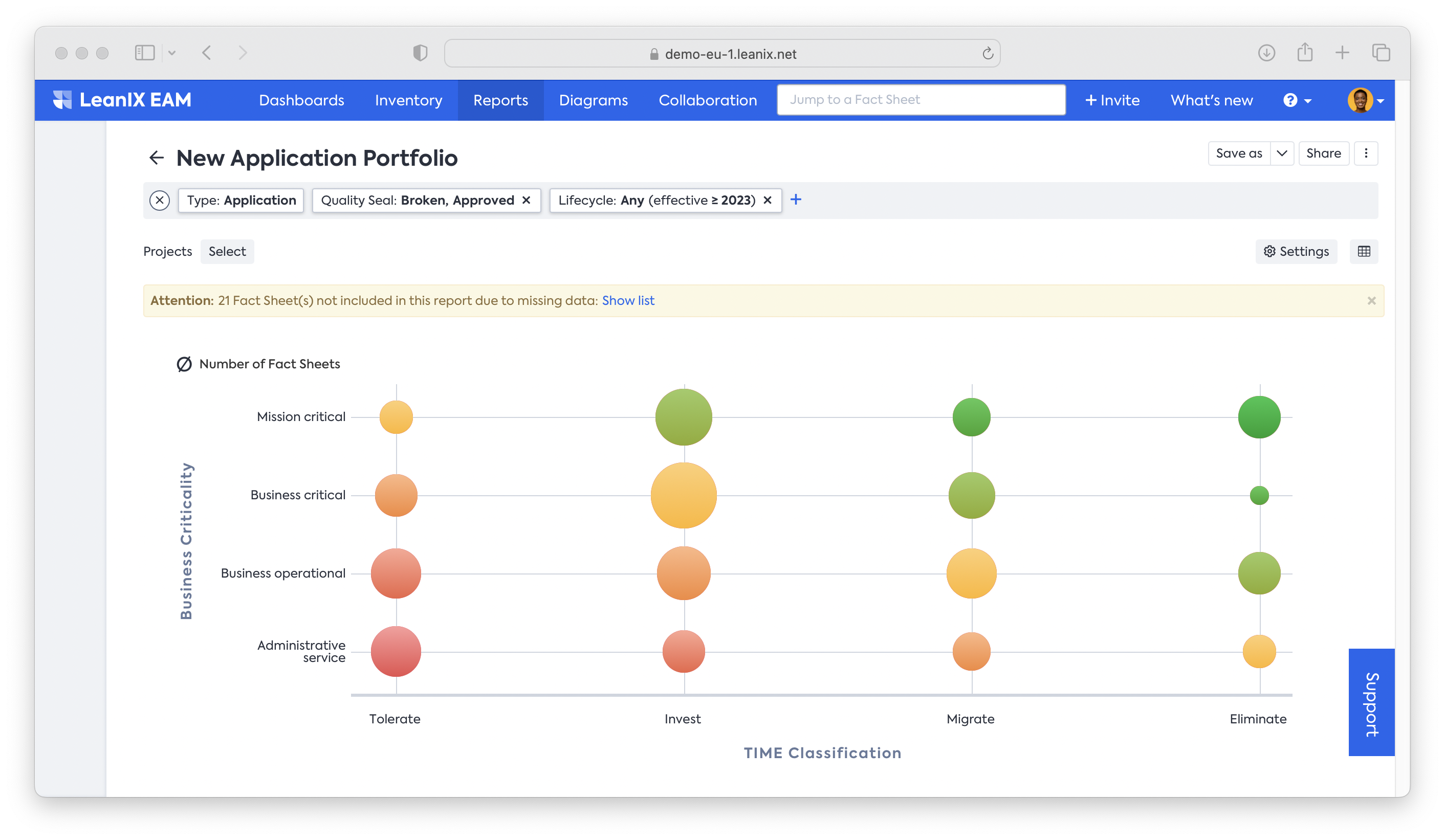
Now that you have finalized the assessment per application, you can start creating insights out of the data. Start looking at your assessed applications by opening up an application landscape report. Apply the necessary filters to narrow down the view to only the applications that are in scope. Change the view to TIME classification. The colors depict the chosen TIME classification from your decision workshops.
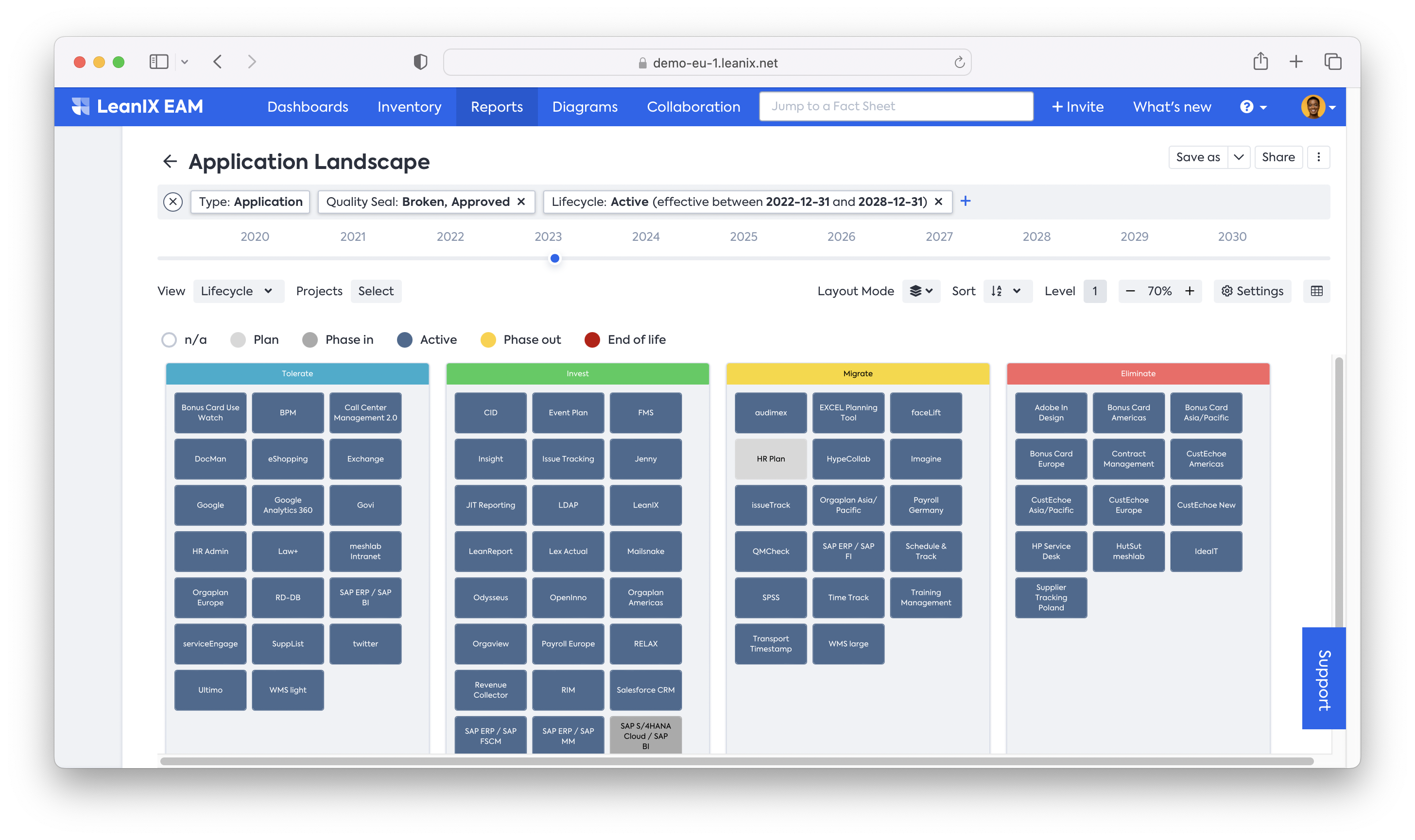
Apply different roll-ups to adjust the layout depending on to whom you’re showing the report. For instance, when showing an overview of all the assessed applications to your senior management, you may want to apply different settings.
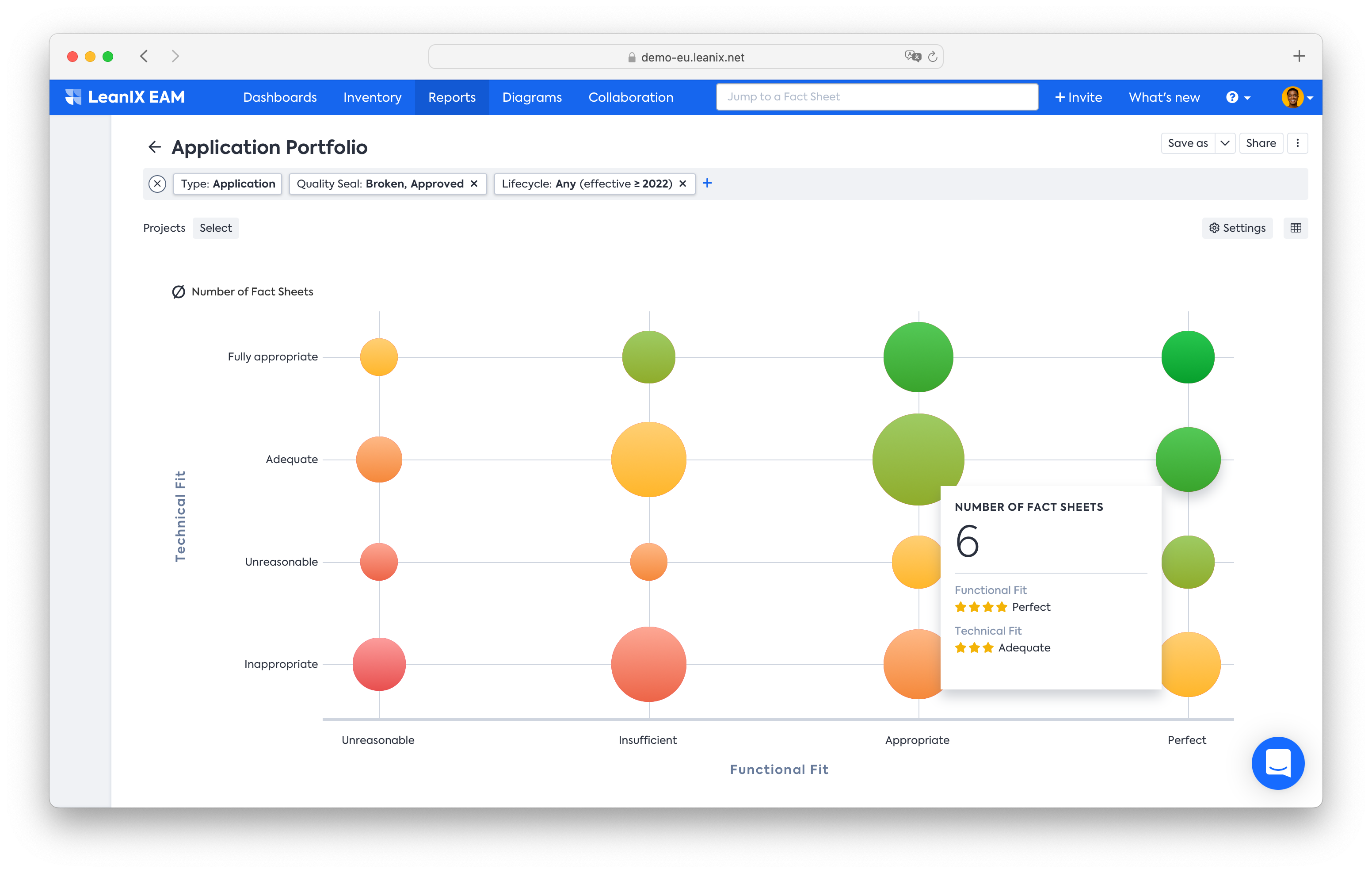
Application Portfolio Report allows you to manipulate your application portfolio to better understand the results of your application rationalization assessment. Open up the application portfolio report and change the x-axis to Functional Fit and the y-axis to Technical Fit. This will give the same overview from the previous table (see the beginning of this page). Instead of using the table, you can refer to this report and determine the TIME assessment per application.
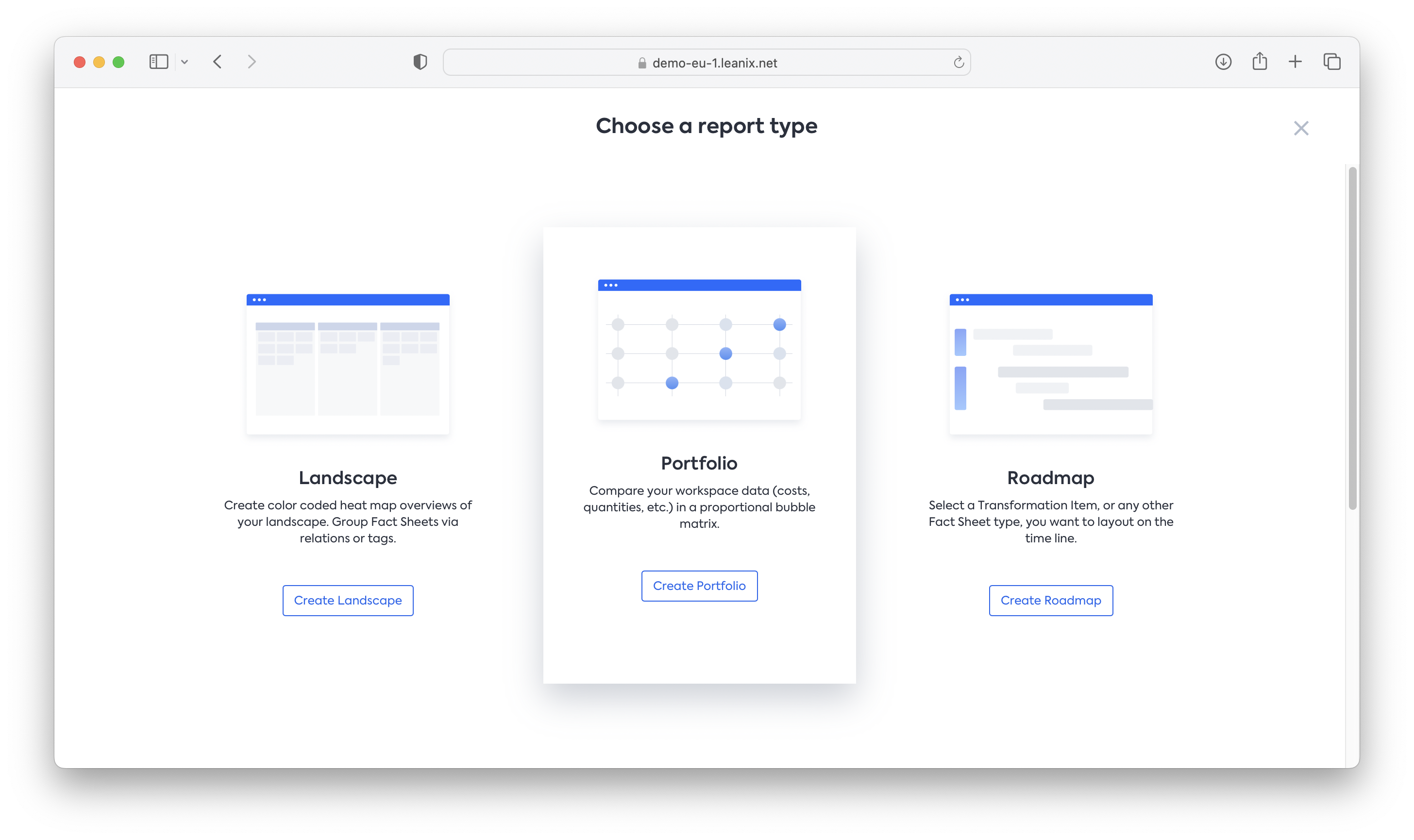
To create a new standard report, you may do as follows:
- Go to the Reports tab and click on New Report
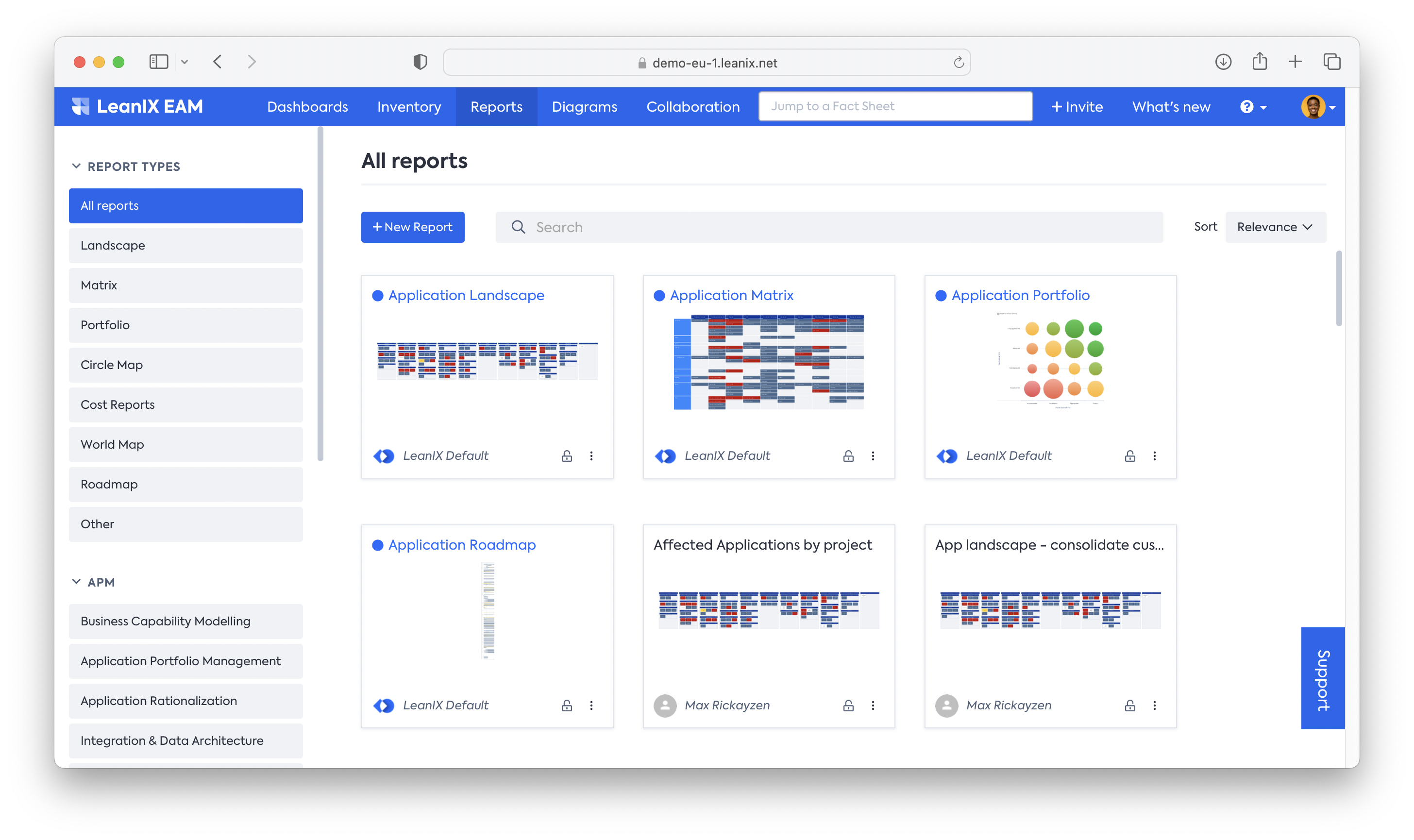
- Choose Portfolio and click on the Create Portfolio
- Put New application portfolio in the Report name, and choose Application Fact Sheet in the Select base Fact Sheet type
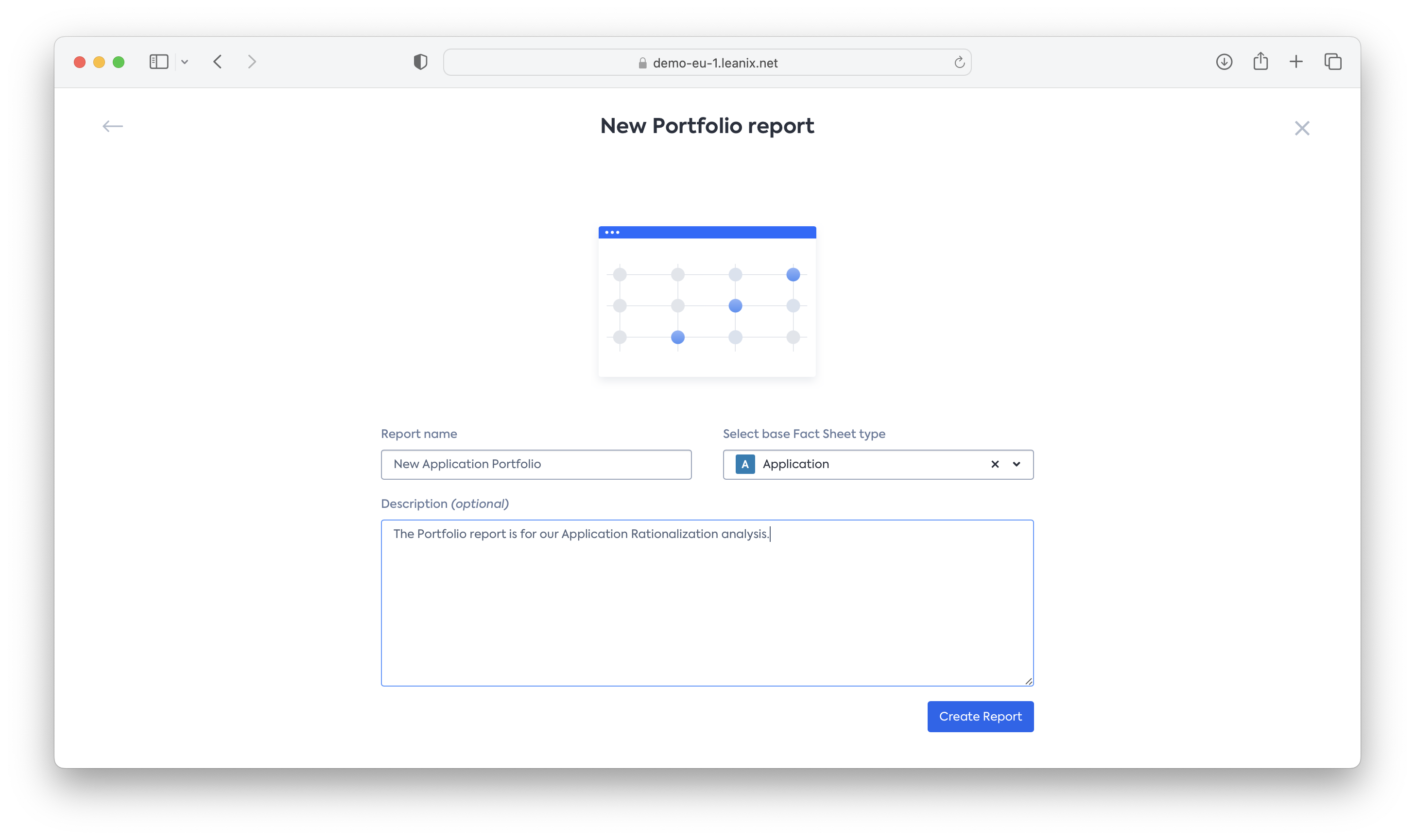
- You will see a portfolio report based on the default values: Functional Fit and Technical Fit
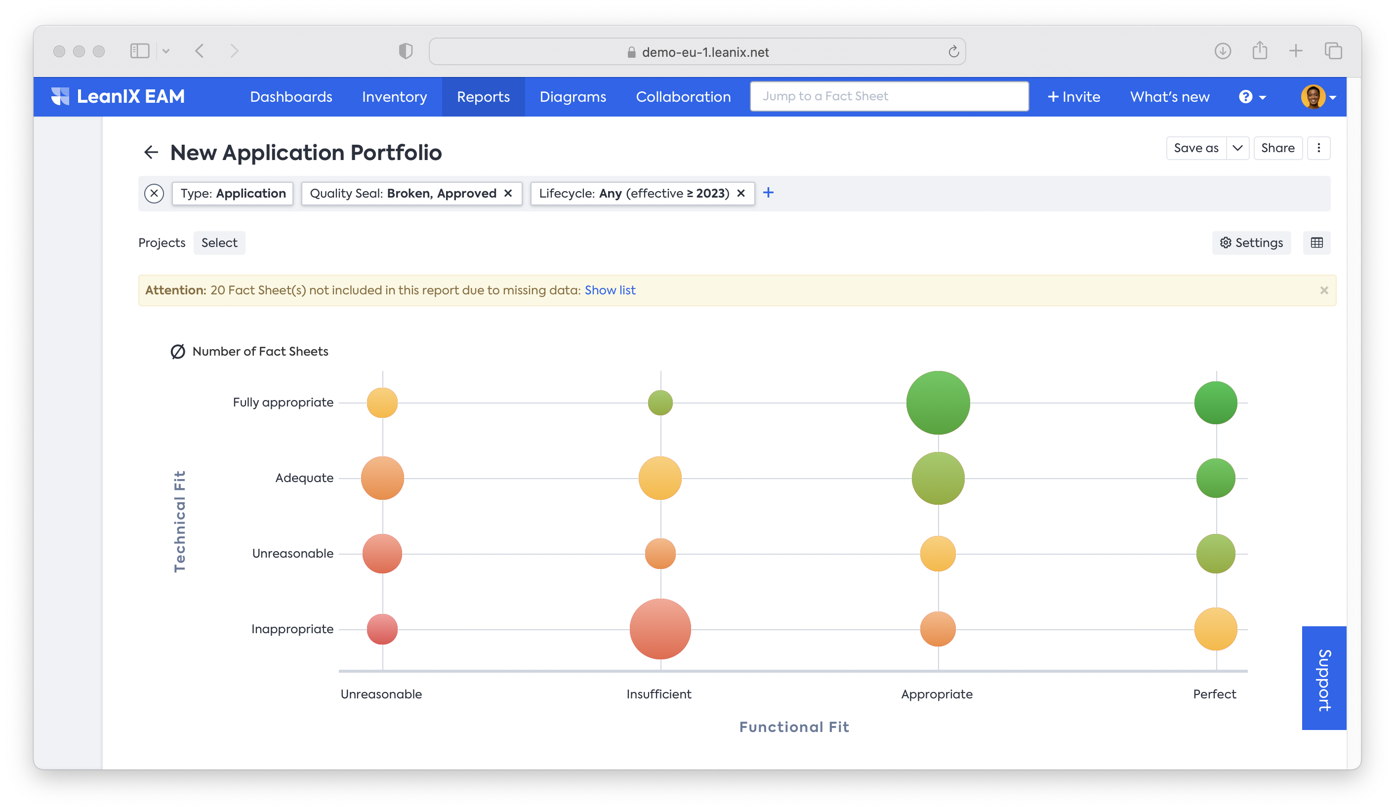
Now that we understand the results of our analysis with regard to Functional and Technical fit, as well as TIME classification, we can start adding more variables to the equation. For instance, by adding business criticality as another variable.
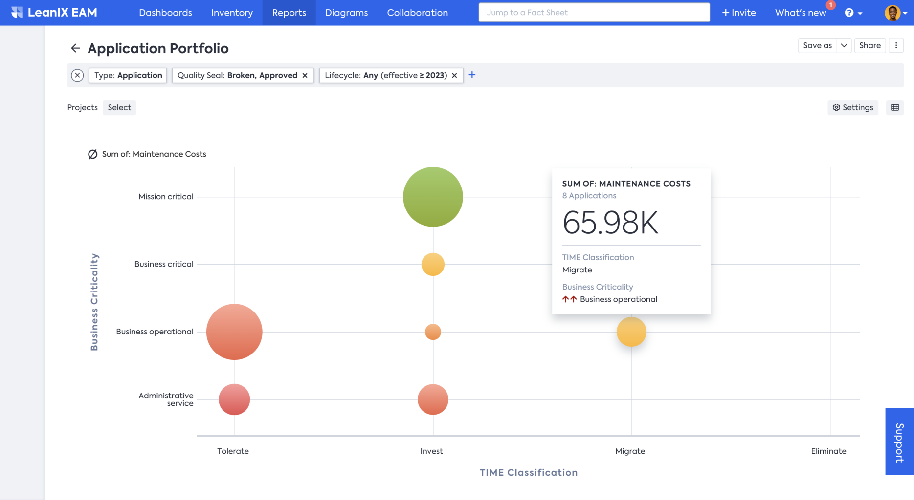
You can then derive later priorities for your transformation roadmap planning. To do so, change the x-axis to TIME classification and the y-axis to business criticality. This allows you to determine quick wins,(for instance, Eliminate and Administrative service), as well as mid- and long-term candidates.
Adjust the report using the following steps:
- Start from the previous application portfolio report
- To change the axis, click Settings and set the x-axis to TIME Classification and the y-axis to Business Criticality
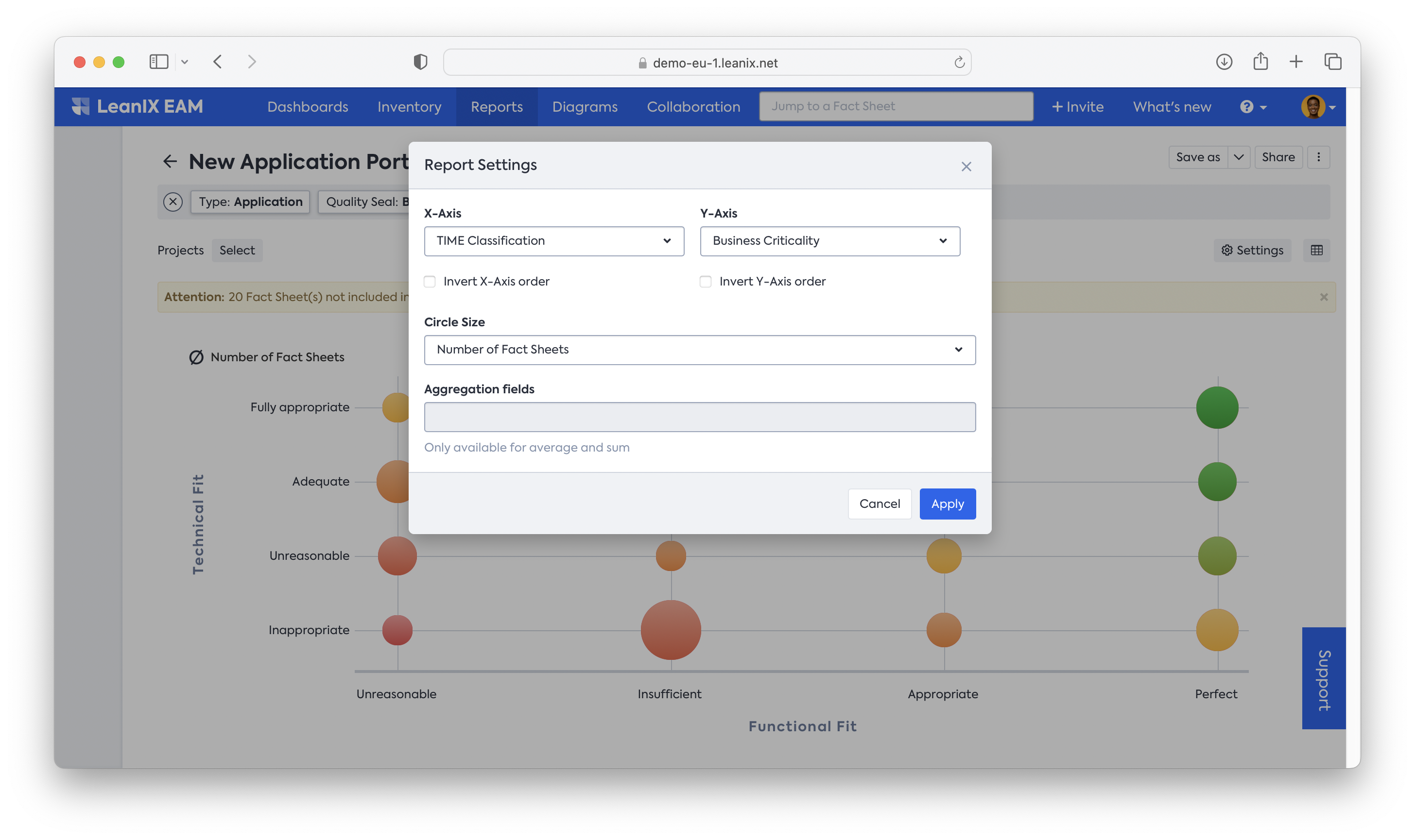
- Your report will be adjusted. Don’t forget to save it in case you want to reuse this setting.
Acquire cost outlook
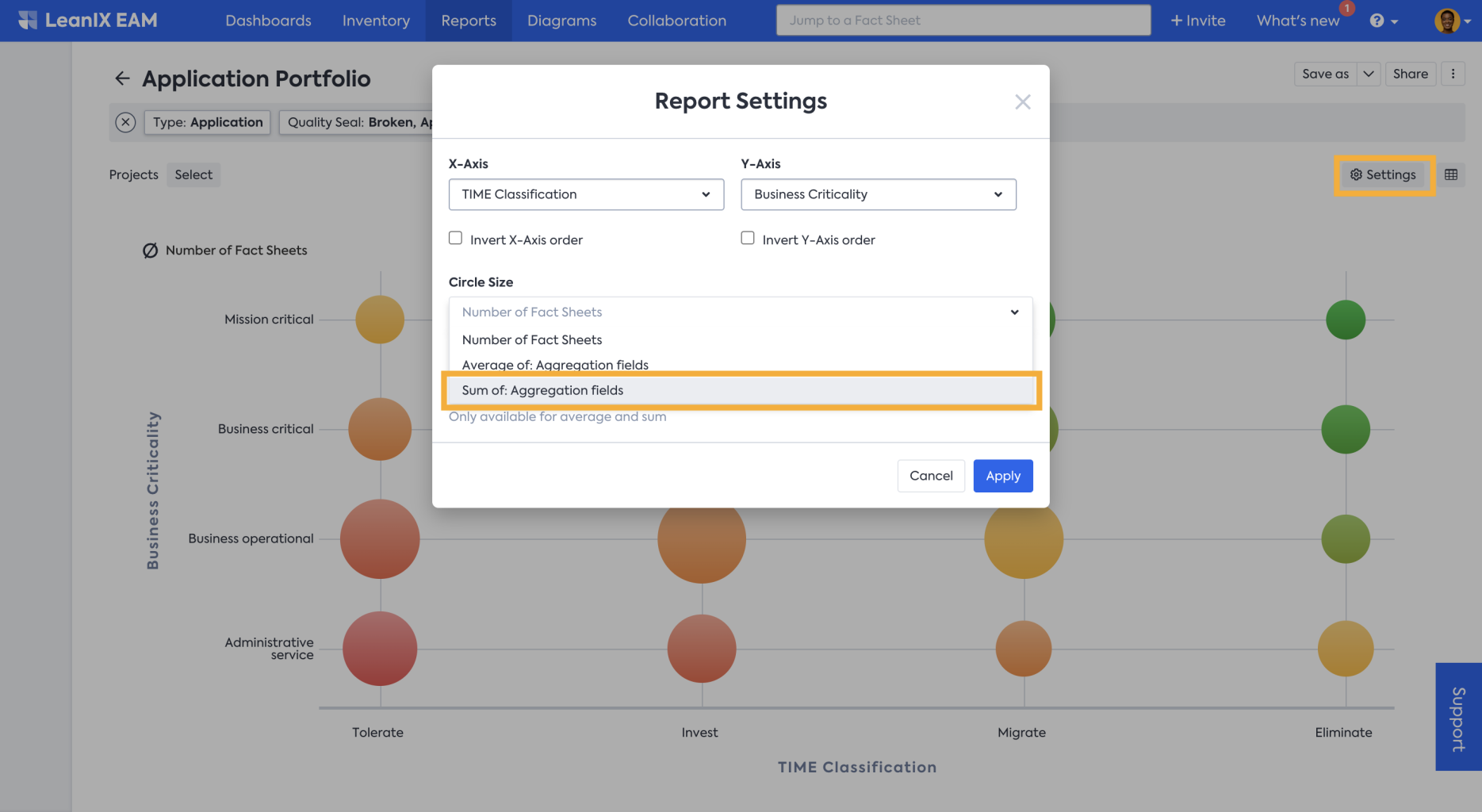
Further, you can also analyze the cost in the same report by making the circle size depict the cost details.
Adjust the report using the following steps:
- Click on Settings, to open the Report Settings menu. From the Circle Size drop-down menu, select Sum of: Aggregation fields and click apply.
- From the Aggregation fields drop-down menu in this example Maintenance Costs (a custom field) is selected. But depending on your needs, you can define and select other attributes.
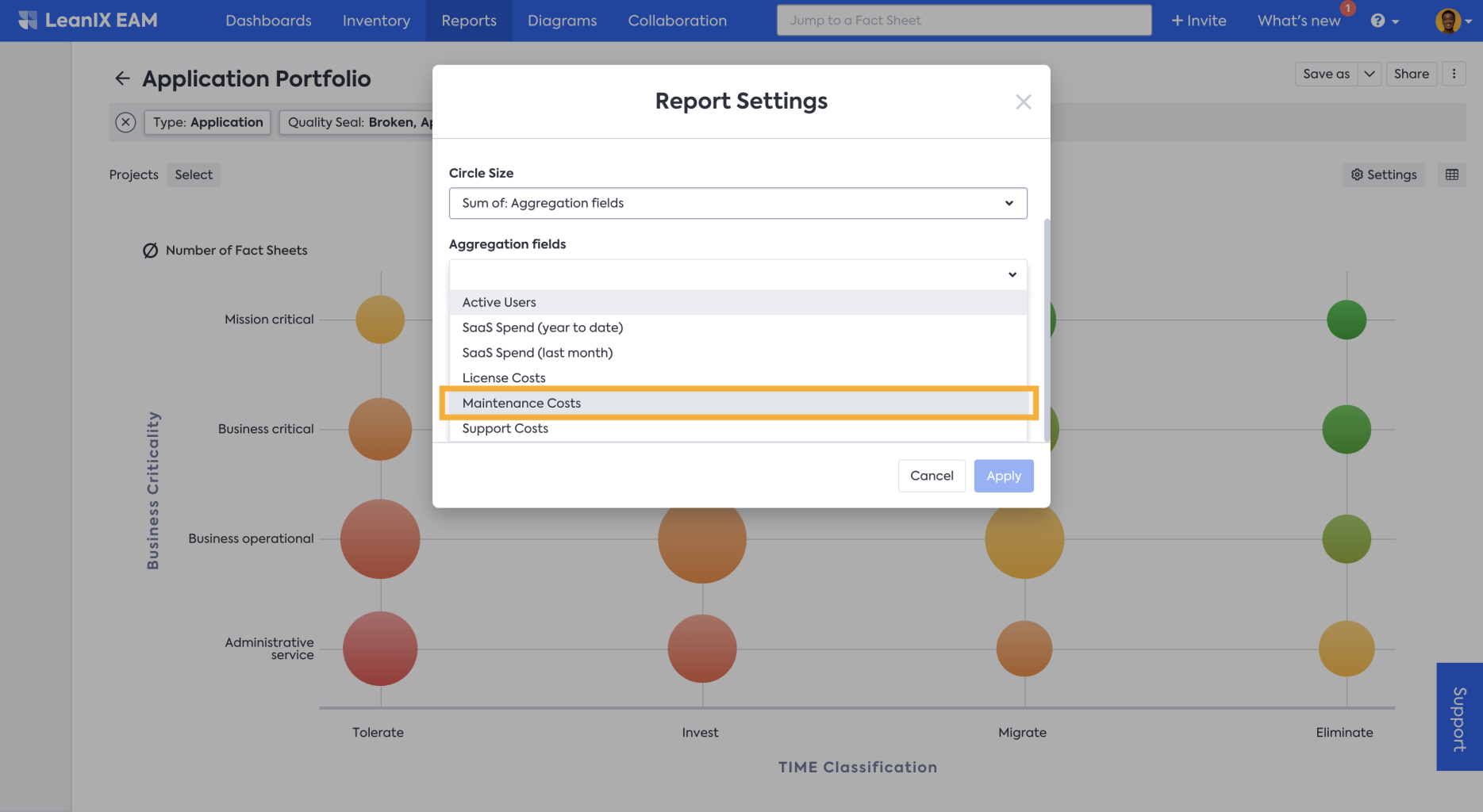
- Now the circle size represents the maintenance cost of those grouped applications, and when you hover over the circle, you can see the summary details in the floating panel.
Information
We recommend creating a separate report collection, to collect all your saved reports. This is the most convenient way to structure and collect all your analysis results in one place. Check out our collections documentation on how to do it.
Next Step
Updated 29 days ago