
Matrix Report
Matrix Report gives you a color-coded matrix view that represents a correlation between 3 different Fact Sheet types. You can use this report to analyze your portfolio on various dimensions at various points in time. For example, to answer a question such as: “Which applications that support ‘Account Management' capability will soon reach the 'End of life' for the 'Europe' user group?”. SAP LeanIX provides several examples of Matrix Reports, as you will discover in the later section. This documentation focuses more on the Application Matrix Report to ensure ease of understanding.
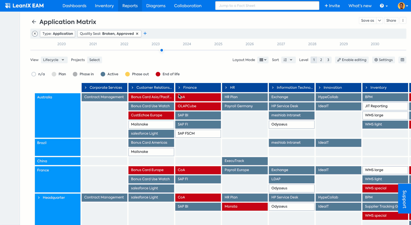
In the example of the Application Matrix Report, you can see that each cell represents the Application Fact Sheet as the base of the report, which has active relations to other Fact Sheets set in the X and Y axis, in this case, Business Capabilities and User Groups.
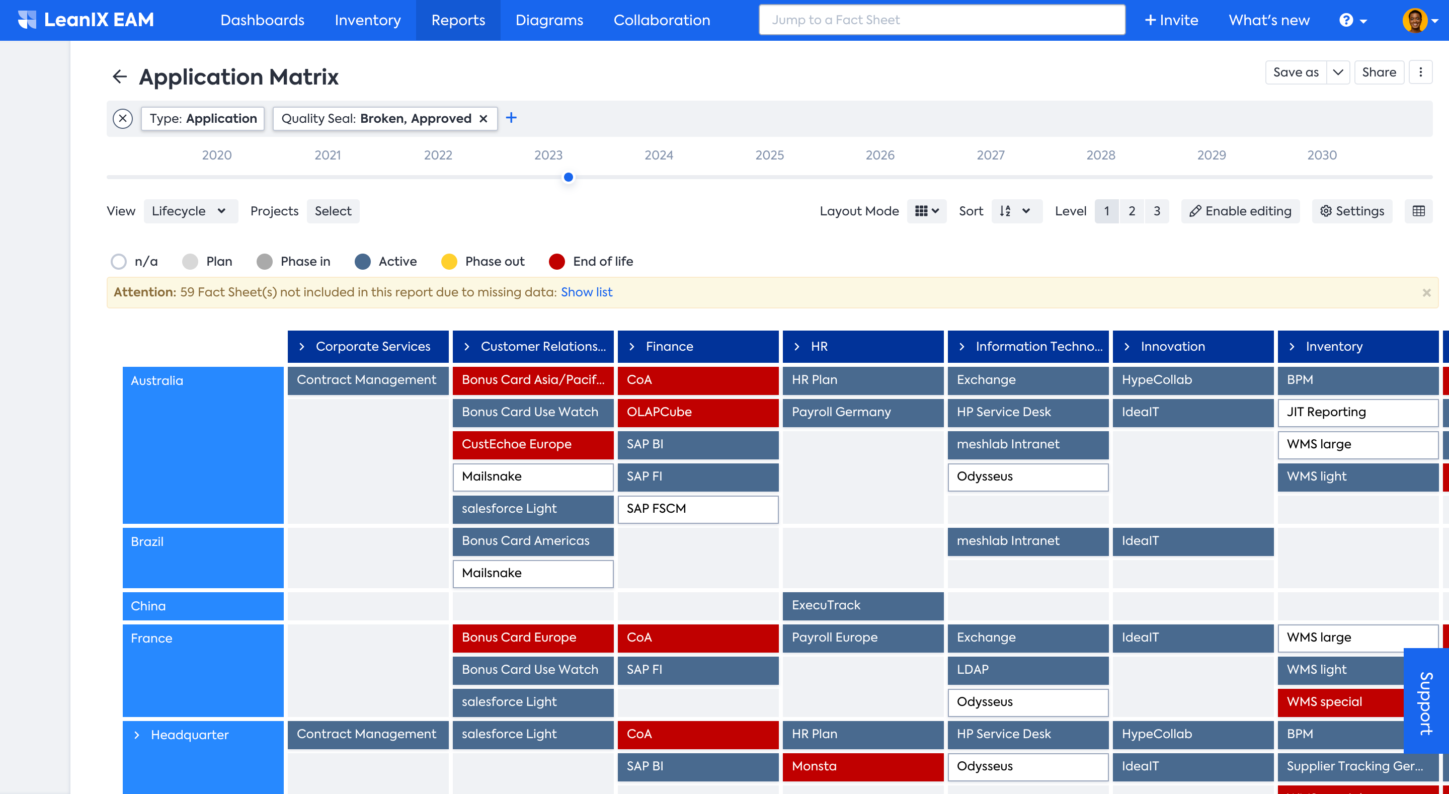
View of Application Matrix Report
HOW is it useful?
Continuing the example from the Application Matrix Reports, Matrix Reports are useful for several reasons:
- Rationalization and optimization: The report helps easily identify which applications are redundant across different user groups or in a different location and thereby supports Application rationalization decisions. It also helps to determine which applications have the potential for increased adoption to enhance standardization and efficiency.
- Manage risks: Identify risks across regions and business capabilities for Applications by visually depicting the IT components which will soon be End of Life
- Prioritization: The report helps IT leaders decide which projects and investments are most important for the organization's success, say, for example, in identifying Projects of significant business value that belong to specific Business Capabilities and Providers.
Using the Matrix Reports
The Matrix report is configurable and can be set to any of the factsheet types present in the workspace data model. Usually, you will see a few default Matrix reports as set by your admin, such as:
- Application Matrix Report gives you a color-coded overview of your Applications, Business Capabilities, and User Groups
- IT Component Matrix Report gives you a color-coded overview of your IT Components, Technical Stack, and Providers
- Project Matrix Report gives you a color-coded overview of your Projects, Business Capabilities, and Providers.
Filters, Views, and Levels
Users can add filters and switch between different views to drill down until they find what they need.
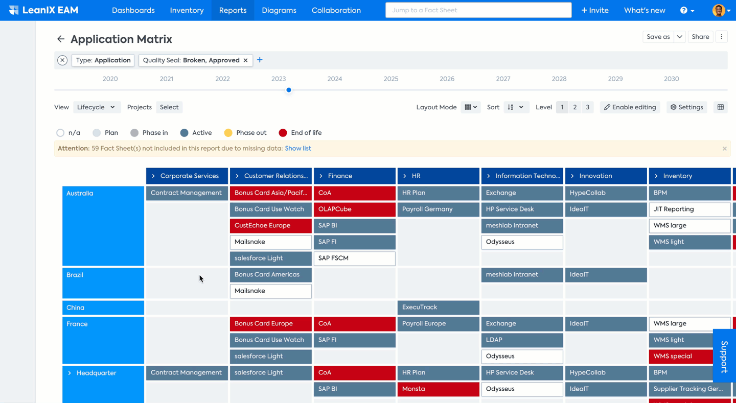
For example, you want to see which applications will soon reach the End of life for only the ‘Australia' User Group. To do so simply hover on the left-hand side of the window, to make the Filter facet appear. Select ‘Australia’ User Group and you will only see applications in ‘Australia’ being used across various Business Capabilities. Since Lifecycle View was already selected, you can see the applications reaching End of life color-coded in red. You can also apply a filter by clicking on the + icon in the filter bar on top. To learn more on applying Filters refer to How to use SAP LeanIX Reports | How to use Filter & Views to create your individual report
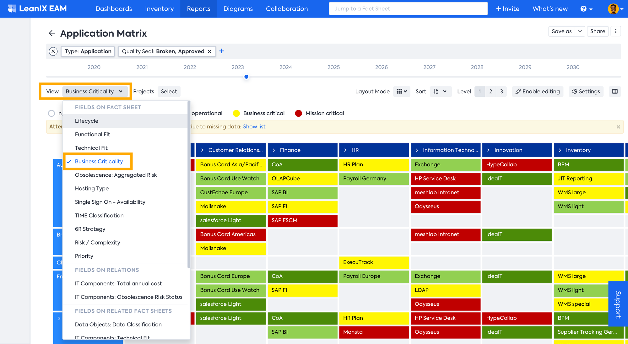
Users are allowed to select from a range of distinct Views when generating a report. Views are essentially attributes or relations, which are represented through a color-coded visualization. Each View offers a distinctive viewpoint on the data, allowing users to obtain more comprehensive insights. For instance, to see a color-coded heat map of applications based on Business Criticality, select Business Criticality from the View drop-down menu. You can find more information in the Report Views article.
You can drill down further to have a detailed view by selecting the appropriate Level. You can Hide/Show Rows and Columns to make it less cluttered or simply switch back to Level 1 mode when showing an overview of all the assessed applications to your senior management.

Layout Modes
In Matrix reports, the layout can be changed for different visualizations as well as for better condensation of information. To get to the different layout modes, simply use the Layout Mode drop-down menu and pick a mode.
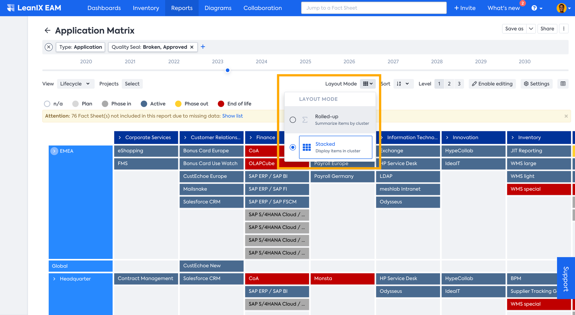
Take for e.g., the Rolled-up Layout, in this layout the clusters get aggregated by the chosen view, by rolling up the contents of every cluster or cell.
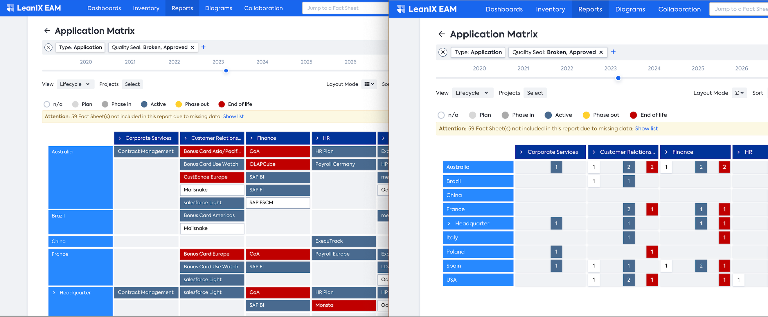
Left side: Matrix Report with detailed layout Right side: Matrix Report with Rolled-up Layout
The Rolled-up Layout allows for easier consumption of more information and also to quickly spot and identify the issues in your Matrix Report.
Adjusting the Column Width
You can adjust the column width by dragging the column border to the desired size. Save your changes if you want to keep the adjusted layout. Adjusting the column width lets you view the full names of your fact sheets.
Editing in Matrix Report
Within the report, users are able to quickly modify Tags, Attributes, and Relations to Fact Sheets using the edit pane. In order to access the edit pane in a Landscape report, select any of the Fact Sheets, that is click on the one that requires modification. A pane will appear on the right-hand side, displaying information about the Fact Sheet and offering the ability to edit its properties. Any adjustments made are immediately implemented within both the report and the Fact Sheet itself. This report also allows doing inline editing by clicking on the enabling editing button. With this enabled, you can directly add or delete cells directly on the matrix.
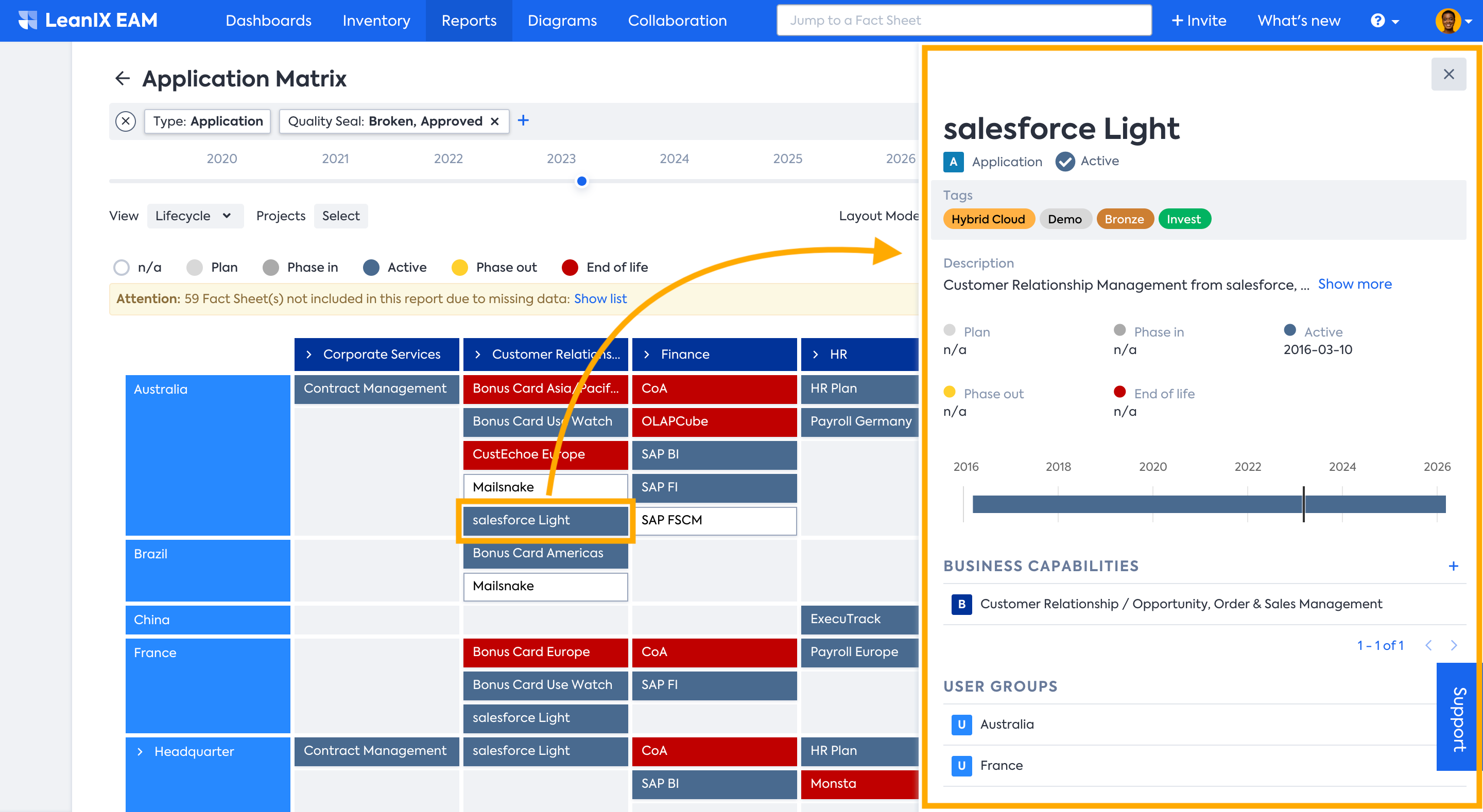
By clicking the Tags area, you can directly add or remove tags in the Editing pane. One can add new relations by clicking on the + Add relation icon and selecting one of the Fact Sheet items. Only the Fact Sheet data that is actually displayed in the Matrix report is editable in the pane. Choosing a different View will result in a different attribute being displayed which then can be edited in the edit pane.
Updated 3 months ago