
Circle Map Report
The Circle Map report shows the interconnections between the Interfaces and Applications in an organization's system architecture. You can group Applications alphabetically or by Business Capabilities to visualize dependencies between them and easily identify provider or consumer applications and analyze their impacts. It is particularly helpful in identifying potential risks while transforming legacy systems.
You can see it as a visual repository of interfaces that helps you track changes and updates in application dependencies in real time. To use the Interface Circle Map report, ensure provider and consumer applications are documented in Interface Fact Sheets.
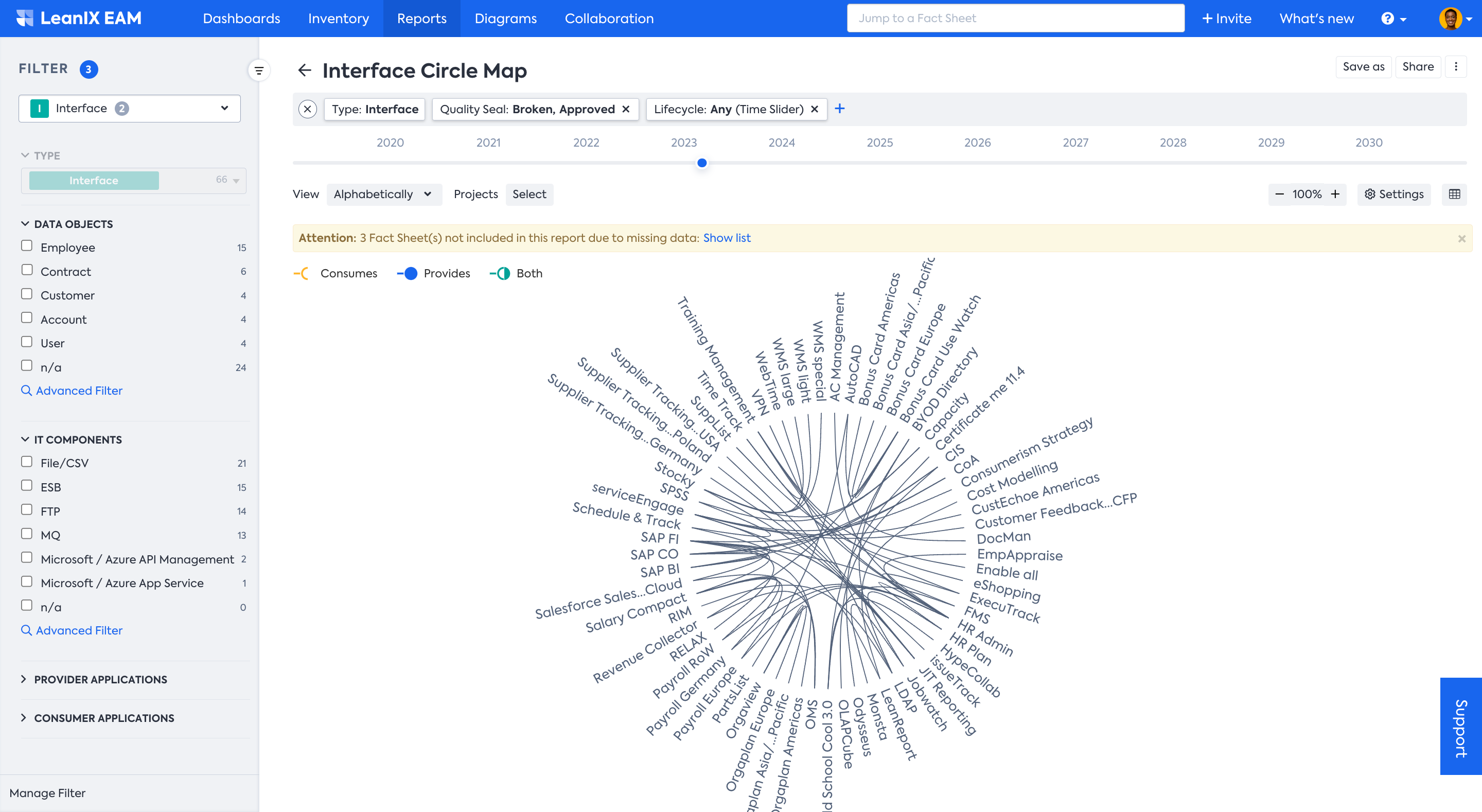
View of the Interface Circle Map
HOW is it useful?
The Circle Map report is a useful tool for anyone looking to gain a deeper understanding of their system architecture and identify potential areas for improvement. Here are some ways in which it is useful:
- Identifying Dependencies and Risks: The Circle Map report provides a clear visual representation of dependencies between different components, making it easier to identify potential risks and issues.
- Transformation planning: The Circle Map is a helpful tool to ensure a smooth transformation, e.g., an ERP transformation, where organizations need an in-depth understanding of interfaces when migrating applications to a new technology.
- Improved Decision Making: The Circle Map report provides a comprehensive and easy-to-understand overview of an organization's system architecture. This information can be used to make more informed decisions in system management.
Utilizing Circle Map Report
You can use Circle Map to help you create an overview of the complexity and to identify interface clusters.
Using the Circle Map Report
The Interface Circle Map report provides a clear visual representation of dependencies and risks and helps determine where APIs are needed. You can simply hover over the Applications to see how they are related to other Applications.
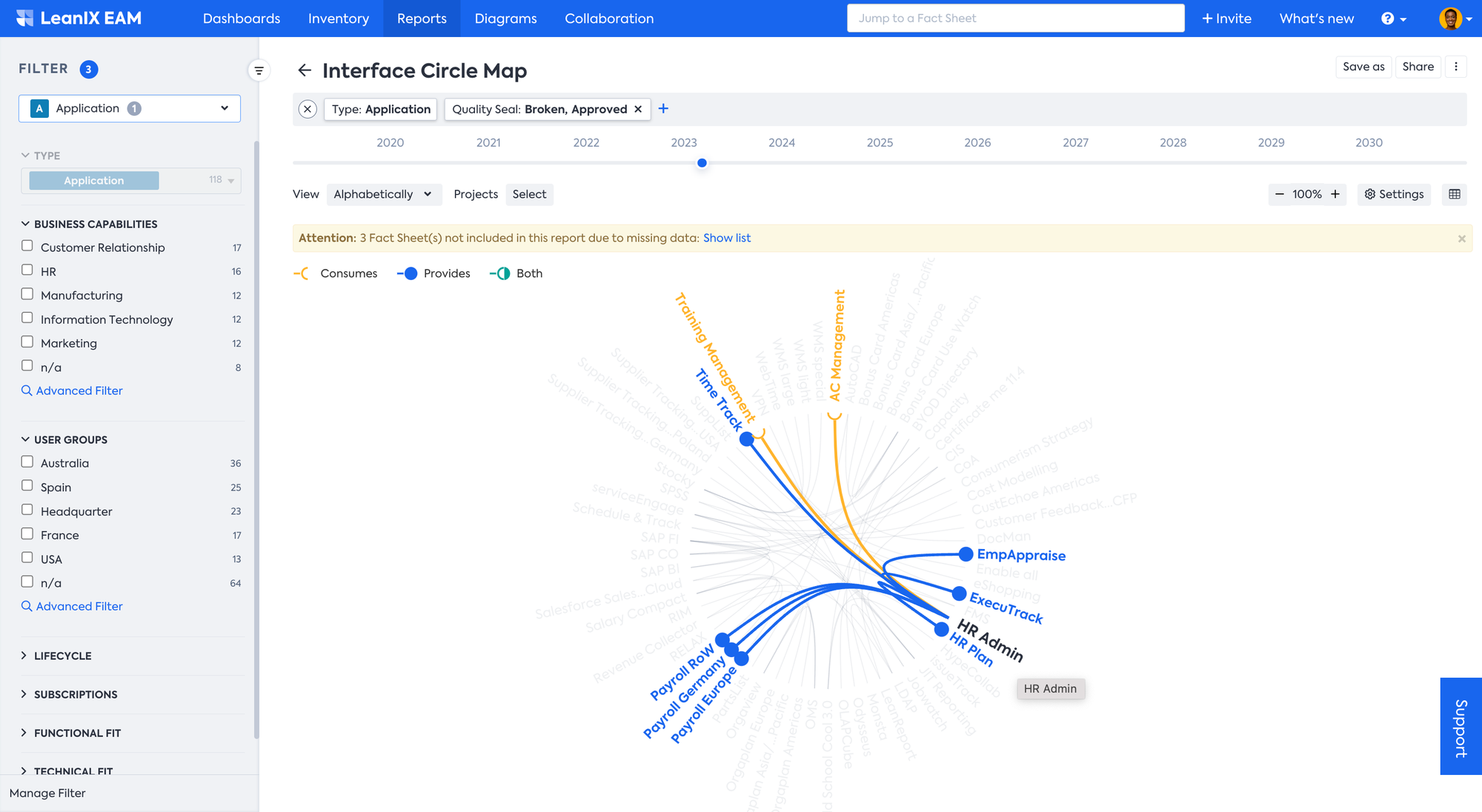
Color-coded lines indicate whether an application is a provider of an interface, or a consumer, or both. It can be both when an application has more than one interface with another application, serving as both provider and consumer. This information can be used to improve the overall integration architecture.
Applying Filter
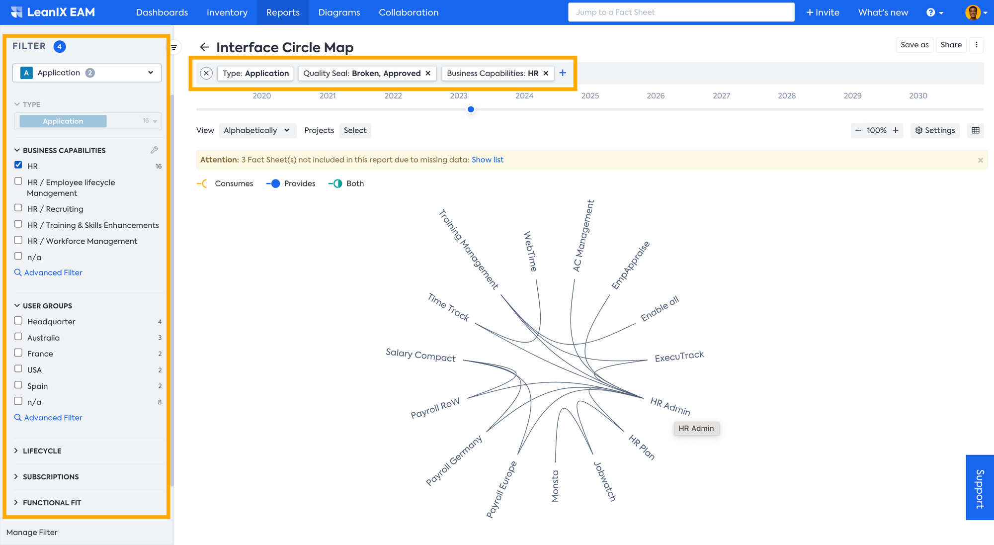
The Interface Circle Map Report allows users to filter data based on specific criteria, such as Business Capability, Technology Component, Application, etc. This can help users create customized views of Interfaces and components. To apply a filter you can use both the filter bar on top or Filter facets on the left-hand side which becomes visible when you move the mouse pointer to the left side of the window.
For example, you can just focus on the Applications and their interfaces being used in one business area, here in the example below Human Resources.
Editing in the Report
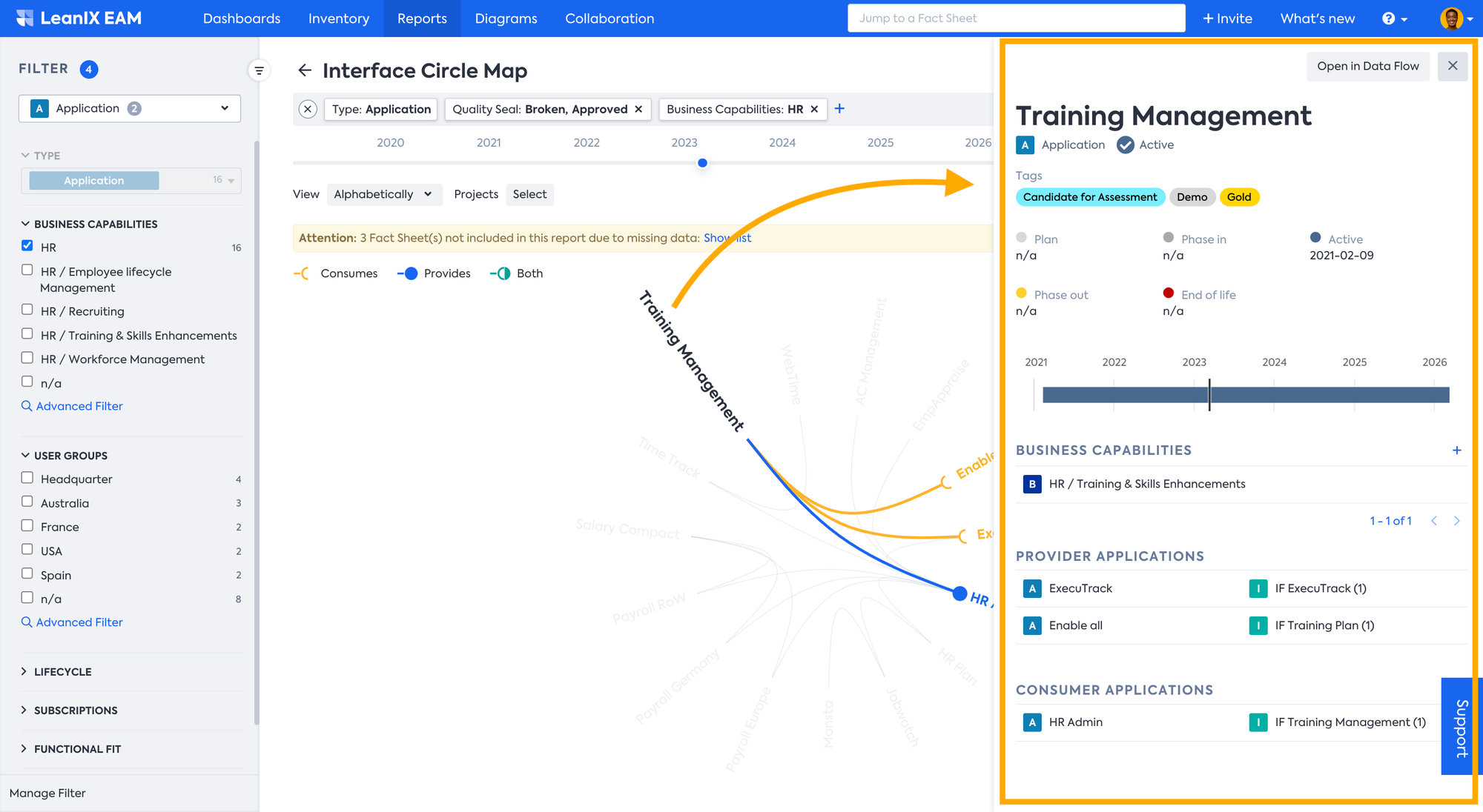
Upon clicking on any Fact Sheet the edit pane will open on the right displaying more information about the Fact Sheet, Business Capability, Provider and Consumer Applications, etc. Within the edit pane, users are able to quickly modify Tags, attributes, and relations to Fact Sheets. Any adjustments made are immediately implemented within both the report and the Fact Sheet itself. Alternatively, you can navigate to the source Fact Sheet by clicking on the Fact Sheet name in the edit pane.
Updated 22 days ago