
Step 8. Track and Report
Ultimately, you want to see where you stand today and what's still left. Track and report is an important exercise. You want to tell a compelling story to everyone interested in your organization's journey to the cloud. Make use of custom dashboards to combine multiple visualizations:
- Create a new and empty Dashboard
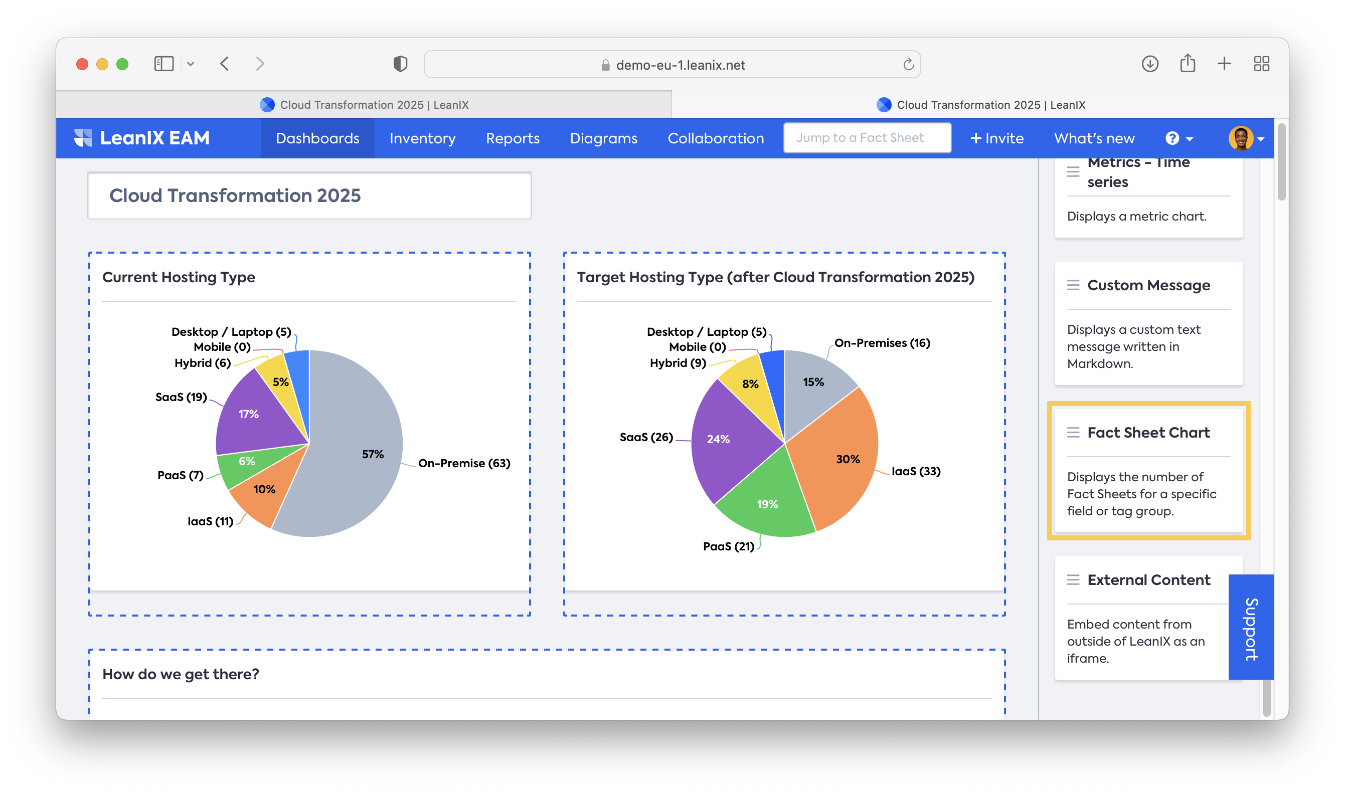
- Create two Fact Sheet Charts, one representing the current state and the other for the target state of the hosting type. The distribution between hosting types becomes even clearer with a pie chart.
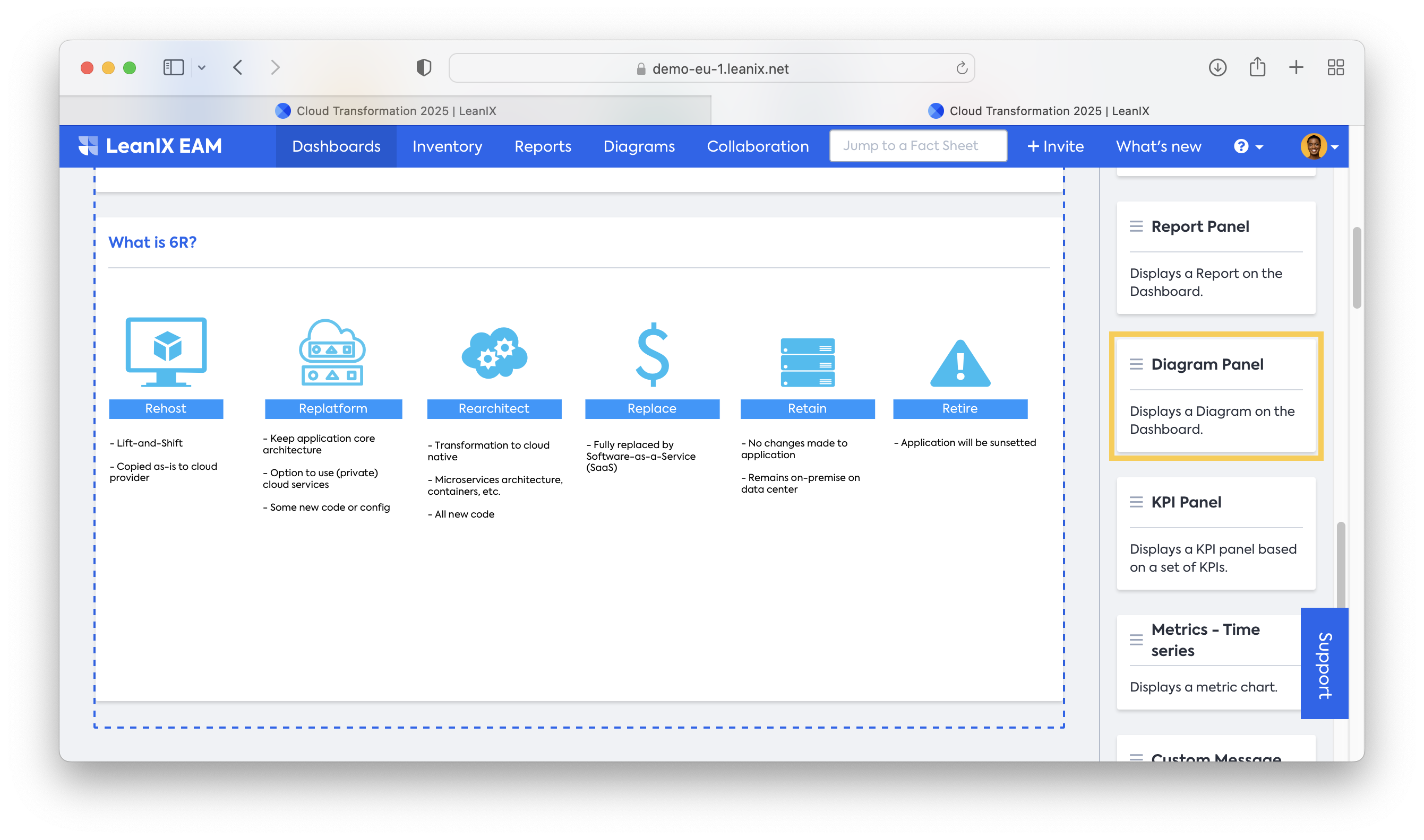
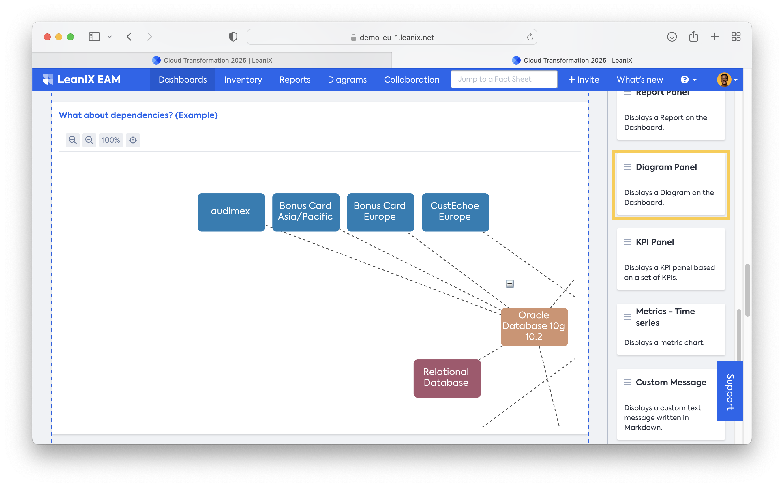
- Demonstrate a framework for how to reach the target state, and keep in mind that not everybody knows about 6R. You can insert a Fact Sheet chart with your 6R decisions per Application and a diagram describing the concept for the users. Additionally, you can insert links in diagrams, e.g., Confluence pages with further documentation. The diagram has to be created (and saved) first and can then be inserted as a Diagram Panel.
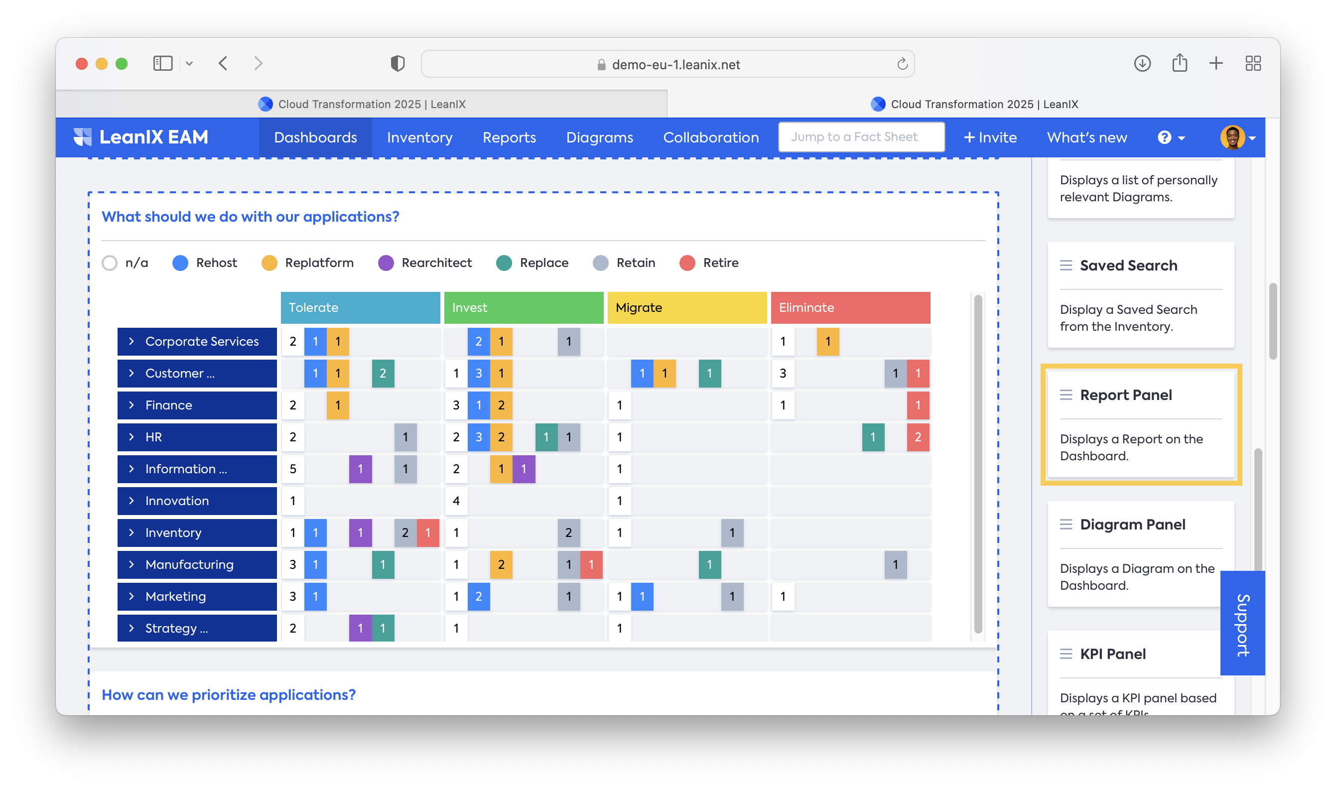
- Bring transparency to all domains with an Application Matrix Report showing the fields for the TIME methodology on the x-axis and a 6R view in a Rolled-up layout. This report has to be created (and saved) first before you can insert it.
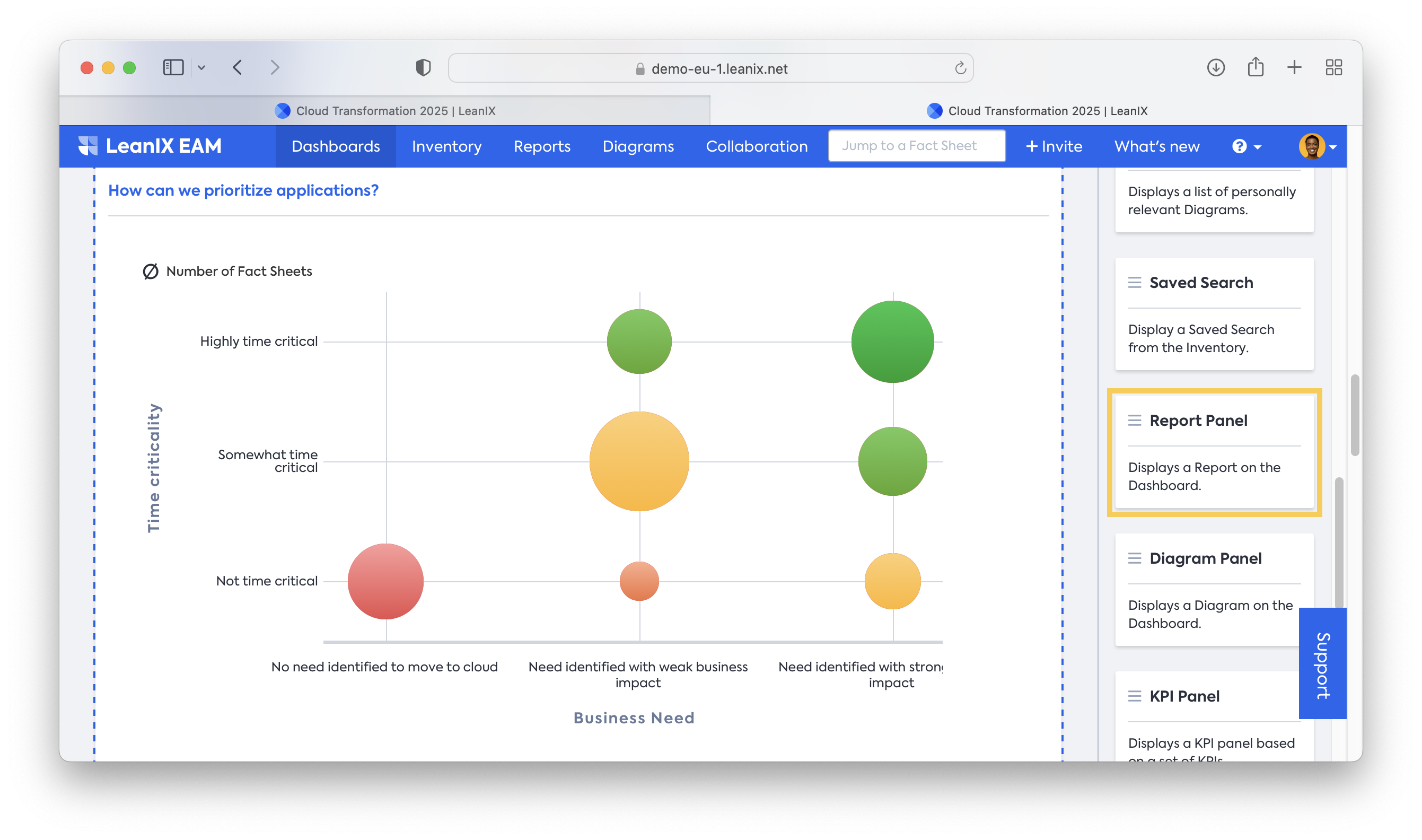
- Prioritize using the Portfolio report with Time Criticality and Business Need as created in Step 6. The top right corner will display Applications that have a strong need for cloud migration, while the lower left corner represents Applications that might not be part of wave 1. Of course, you can switch your axis to any available criteria.
- Indicate dependencies and raise synergies of your most significant applications. With Diagrams, you might identify that an IT Component serves more than the to-be-migrated Application, and a combined migration generates more benefit. Another example might be that you want to migrate Applications that rely on a certain Provider, which you can easily identify in a diagram. Again, the diagram has to be created (and saved) first before inserting it into a dashboard.
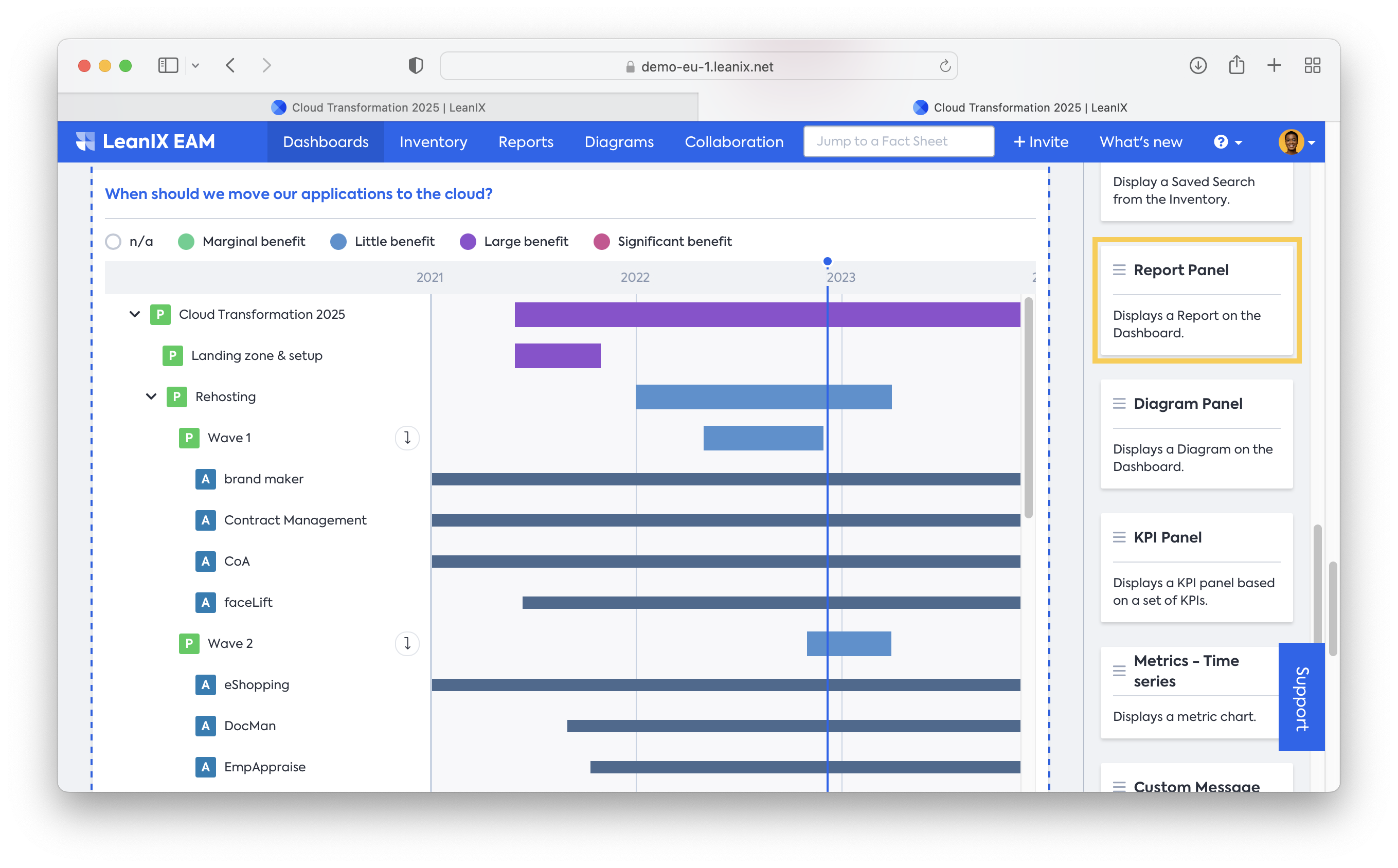
- Develop a roadmap to make this transformation more accessible for all users. Create a Roadmap report for Projects and filter for your “Cloud Transformation” project to see all 6R initiatives and below waves. Once you develop a timeline for these projects, you can drill down to Applications (Drilldown in the report settings) to see the Application’s timeline. All Applications in “Replace” should have an "end of life date" in their lifecycle. Now you can use the different lifecycle bars to identify needed adjustments in your transformation. Additionally, leverage the Business Value view to visualize the estimated benefit for every project.
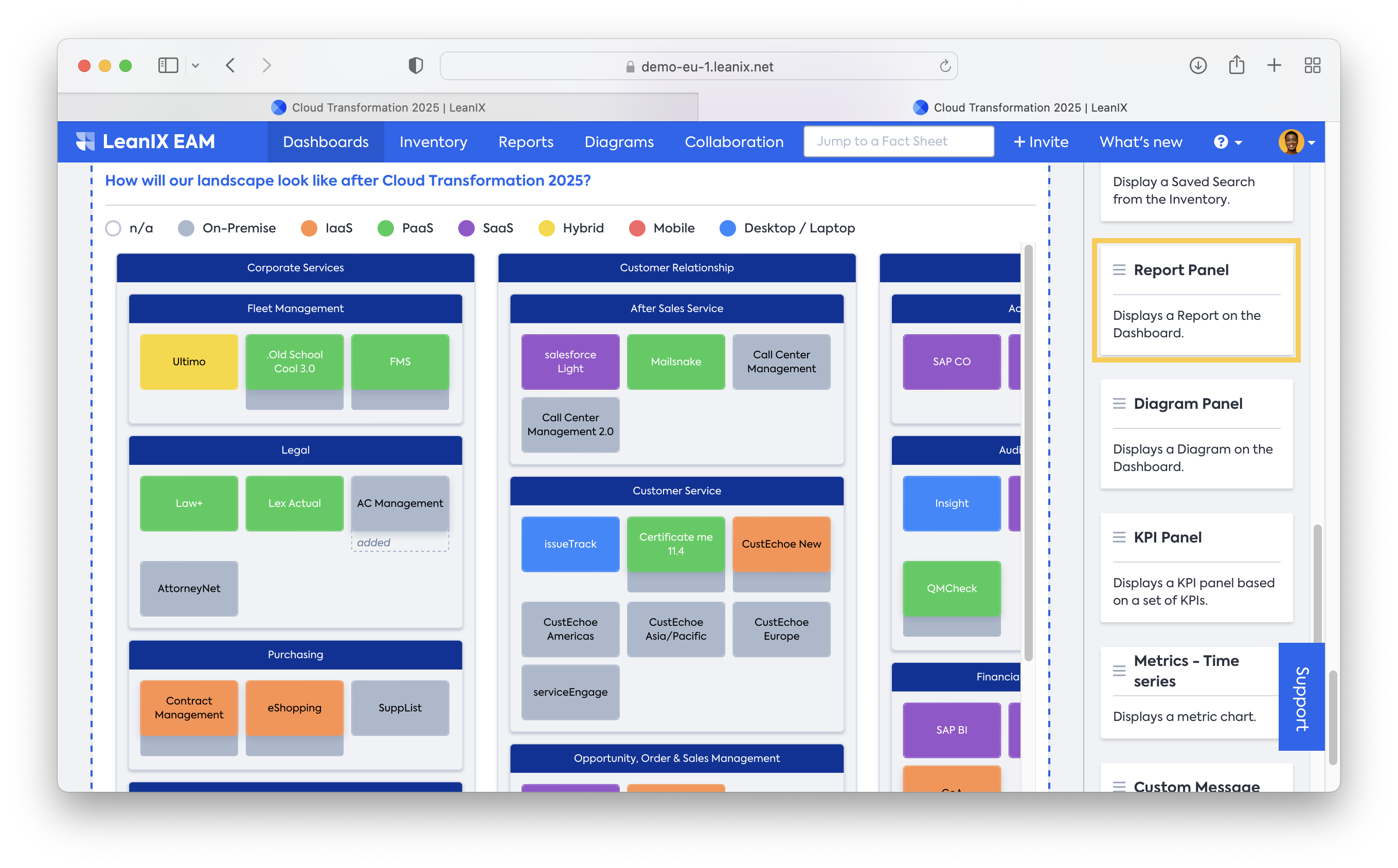
- Finally, you want to visualize the effects on your landscape once this transformation is complete. Use the time slider in a landscape report and compare the current day with your transformation's end date (by holding down the shift key). By leveraging the “view” for hosting type, you can create a heatmap of expected changes for every application. This is a detailed version of your target state pie chart from the top of the dashboard.
Resources
Academy course: Section 3B - Cloud Migration Course (only available for SAP LeanIX customers and partners)
Updated 28 days ago