
Dashboards
Dashboards enable you to consolidate and interpret data in one place, facilitating informed decision-making and promoting efficient task management. Learn how to create, customize, and manage dashboards.
Overview
The dashboard is the central hub where you can consolidate and present key information and metrics about your enterprise architecture management data in an organized and easily accessible way. You can use reports, diagrams, charts, graphs, and summaries to provide a quick overview of your enterprise architecture management data and performance.
Dashboards make it easier to identify trends and patterns and help you effectively communicate your insights to different stakeholders. They play a vital role in strategic planning by helping C-level stakeholders make informed decisions and stay aligned with organizational goals.
Dashboards offer a comprehensive and real-time overview and can serve as a centralized hub for tracking progress and identifying areas that require attention or action by displaying new and pending action items, surveys, and more. When you sign in to SAP LeanIX, you automatically land on the default dashboard. You can navigate between the dashboards available to you using the left-side navigation pane.
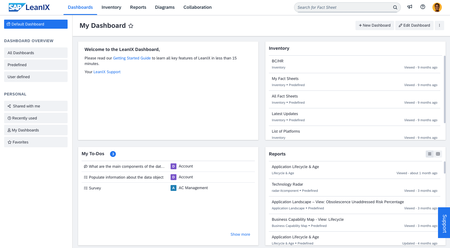
Example Default Dashboard
This guide covers how you can create and edit dashboards to consolidate data from various sources into a single, easy-to-navigate view, enhancing communication and oversight. To learn about various administrative settings that workspace admins can manage, see Dashboards Settings.
Creating a Dashboard
You can create new dashboards to facilitate stakeholder management and showcase key deliverables and objectives specific to major initiatives.
To create a new dashboard, follow these steps:
-
On the dashboard page, click New Dashboard.
-
On the page that appears, enter a name for the dashboard and select how you want to proceed: create an empty dashboard from scratch or copy an existing dashboard and then customize it to your needs. Selecting an existing dashboard as a template allows you to create new dashboards with less effort, making it easier to tailor information for different stakeholders or teams based on their roles and responsibilities.
-
Click Create Dashboard. You land on the dashboard editing page.
-
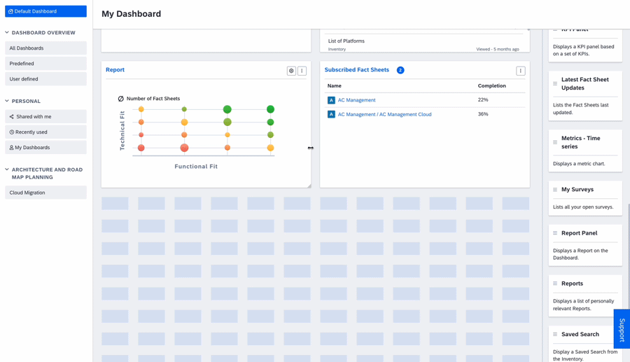
To add panels to the dashboard, drag and drop them from the right-side panel to the dashboard grid. If prompted, configure the panel by providing a title and selecting the elements to include, then click Save. You can include reports, diagrams, fact sheet charts, KPI panels, and more.
Recommendation
For optimal performance and to prevent potential slowdowns, it's recommended to limit the number of panels added to dashboards, particularly those containing large volumes of data, such as saved searches. Try to avoid adding more than 30–40 panels to a dashboard for the best user experience and system performance.
-
Adjust the dashboard layout. You can move, resize, duplicate, and delete panels.
To resize a panel, hover over the panel border until the cursor transforms into a double-sided arrow, click and hold the border, then drag it to achieve the panel size that you need. You can also use keyboard shortcuts to resize panels and perform other actions. To learn more, see Keyboard Navigation and Shortcuts.
You can apply the global filter to the dashboard to filter contents in all panels. To learn more, see Global Filtering in Dashboards.
-
Click Save.
Resizing and Moving Dashboard Panels
Global Filtering in Dashboards
The dashboard's global filter allows you to apply filters across multiple dashboard panels. This lets you customize and reuse dashboards for different stakeholder groups or business units without the need to duplicate the dashboard or edit individual panels. The affected panels display the filtered content, streamlining your data presentation process.
Global filters affect the following types of panels:
- Reports
- Fact sheet charts
- Saved searches
Note
Global filters are added on top of filters already applied at the panel level. The scope of global filters is only limited to dashboards and does not affect filters elsewhere in the workspace. Therefore, your reports, diagrams, or saved searches remain unaffected by global filters. For example, when you open a report from the dashboard, you get the view with the original filters set at the report level.
If a global filter is not applicable to a panel or conflicts with panel-level filters, a banner is displayed on the affected panel saying the filter can not be applied. The banner will not affect the appearance of the dashboard, as it is visible only during dashboard editing.
The dashboard's global filter is fact sheet type specific. For example, if you want to filter applications with relation to certain organizations, you need to choose the application fact sheet type and then specify the related organizations.
Applying the Global Filter
Follow these steps:
-
When creating or editing a dashboard, at the top of the dashboard, click Apply global filter.
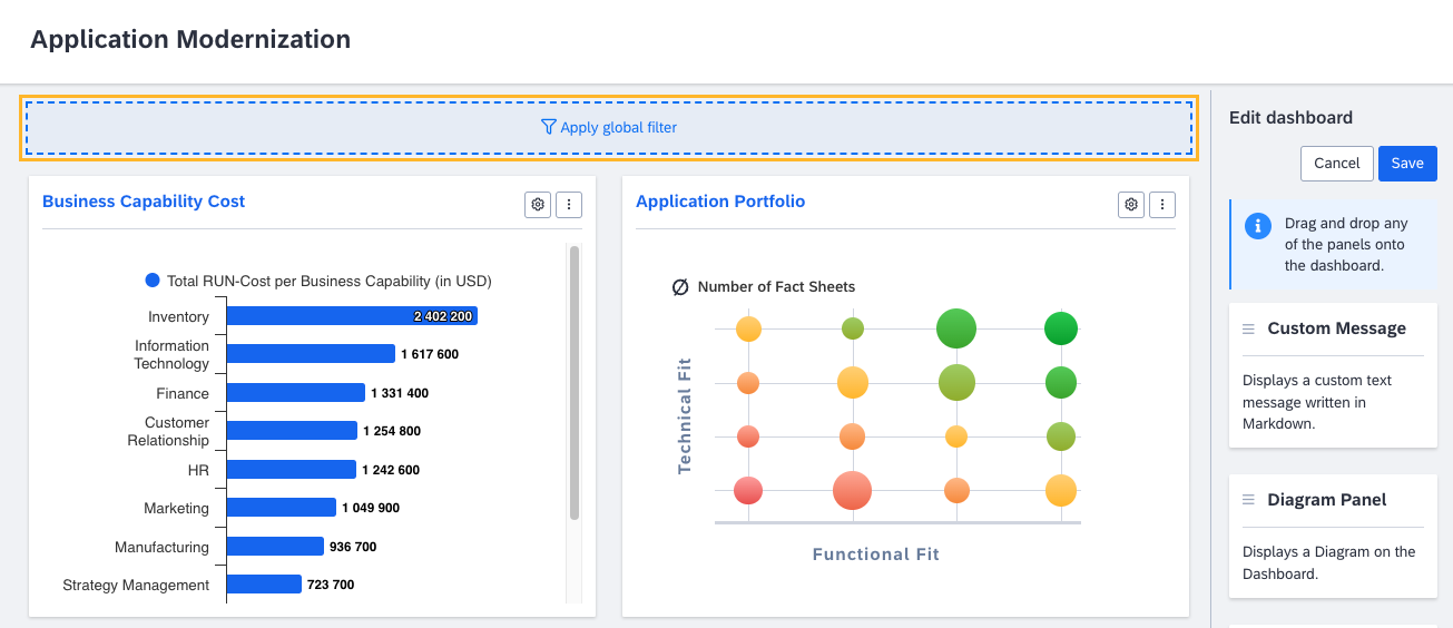
Applying the Global Filter to a Dashboard
-
In the dialog that appears, apply the filters that you need, then click Use Fact Sheet Filter.
The applied filters appear at the top of the dashboard. You can add or modify them to meet your needs. The content of the dashboard panels updates accordingly based on the applied filters.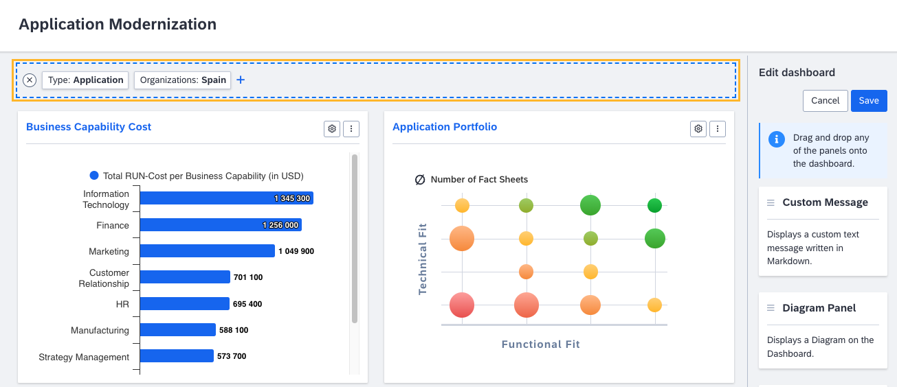
Applied Global Filters
-
To save the dashboard with the global filter applied, click Save.
The dashboard is saved with the applied filter. The dashboard panels display filtered content.
Managing Dashboards
Editing a Dashboard
You can edit a dashboard to update information, add new panels or metrics, customize the layout, or refine the visual presentation to better meet the evolving needs of stakeholders or teams.
Note
The ability to edit a dashboard depends on the permission that you have for this dashboard. For more information, see Dashboard Permissions.
To edit a dashboard, click Edit Dashboard in the upper-right corner, make the changes that you need, then click Save. You can do the following:
- Add panels: To add a panel to the dashboard, drag and drop it from the right-side panel to the dashboard grid. If prompted, configure the panel by providing a title and selecting the elements to include, then click Save.
- Duplicate or delete panels: To duplicate or delete a panel, click the three-dot icon in the upper-right corner of the panel, then select the option that you need.
- Configure panels: To configure a panel, click the gear icon in the upper-right corner of the panel, apply the changes that you need, then click Save. Some panels are non-configurable.
- Apply the global filter: You can apply the global filter to the dashboard to filter contents in all panels. To learn more, see Global Filtering in Dashboards.
- Resize panels: To resize a panel, hover over the panel border until the cursor transforms into a double-sided arrow, click and hold the border, then drag it to achieve the panel size that you need. You can also use keyboard shortcuts to resize panels and perform other actions. To learn more, see Keyboard Navigation and Shortcuts.
- Save a dashboard copy: You can save your current work as a new dashboard without changing the original dashboard. To do that, on the right-side panel, click Save > Save as, then adjust the details of the new dashboard as needed in the dialog that appears. Changes are saved to the new dashboard, leaving the original one unchanged.
Setting the Default Dashboard
When you sign in to SAP LeanIX, you land on the default dashboard. The workspace admin configures whether users can set their default dashboard or not. If this is not allowed, you automatically land on the default dashboard set by the admin or the predefined dashboard. For more information, see Default Dashboard in the administrator guide.
If selecting default dashboards is allowed, you can set any dashboard, except the predefined ones, as your default. To do that, in the upper-right corner of the dashboard, click the three-dot icon > Set as Default.
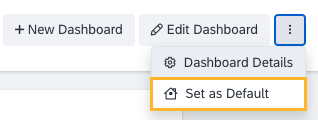
Setting a Dashboard as Default
You can also set a dashboard as default from the dashboard details page. To do that, enable the My Default Dashboard toggle, then save the changes.
Sharing a Dashboard
You can share a dashboard with other users to foster collaboration and ensure that team members have access to the same insights. To view the dashboards shared with you, select Shared with me on the left-side navigation pane.
To share a dashboard from an overview page listing multiple dashboards, on the dashboard preview, click the three-dot icon > Share, select users, then click Share.
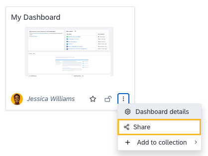
Sharing a Dashboard from the Dashboard Preview
To share a dashboard from the dashboard details page, navigate to the Shared with tab, select users, then click Share.
Adding a Dashboard to a Collection
Collections enable you to arrange and categorize your dashboards, reports, and diagrams into custom groups defined by the workspace admin. For more information, see Collections.
As an admin, you can add dashboards (except for predefined ones) to collections to arrange them into groups by relevant topics. Collections appear on the left-side navigation pane and are arranged into collection groups. If a collection doesn’t contain any dashboards, it doesn’t appear on the left-side navigation pane.
To add a dashboard to a collection, on the dashboard preview, click the three-dot icon > Add to collection, then select a collection. You can add a dashboard to multiple collections.
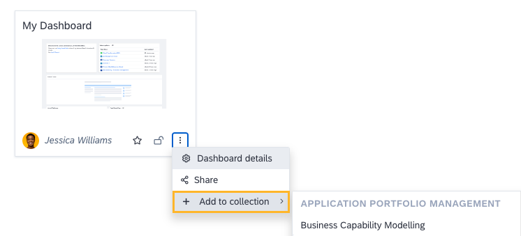
Adding a Dashboard to a Collection
To remove a dashboard from a collection, navigate to the collection from the left-side pane, click the three-dot icon on the dashboard preview, then select Remove from [Collection].
Adding a Dashboard to Favorites
You can mark user-defined dashboards as favorites for quick access to frequently used dashboards. To do this, in the dashboards list, click on the star icon on the dashboard. You can also mark a dashboard as a favorite from the dashboard details page.
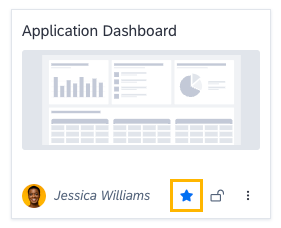
Marking a Dashboard as a Favorite
Dashboards that you mark as favorites are indicated by a blue star. They appear in the Favorites section in the Personal collection.
Note
There is no limit to the number of favorites you can have, but marking too many dashboards as favorites may defeat the purpose.
Dashboard Details
To navigate to the dashboard details page, click the three-dot icon on the dashboard, then select Dashboard Details. Here, you can view the dashboard details and, if you have the corresponding permission, update them.
Dashboard Permissions
By default, dashboards are created as unrestricted, which means that all workspace users can view and edit them. Restricting the dashboard's read and write permissions helps control access and maintain data confidentiality. It ensures that only authorized users can view and modify the dashboard, preventing unauthorized access and potential data breaches. The dashboard owner always has write permissions.
The following table lists default dashboard permissions for standard user roles.
| Action | Admin | Member | Viewer |
|---|---|---|---|
| Create a new dashboard | Yes | Yes | Yes |
| Delete a predefined dashboard* | Yes | No | No |
| Delete a default dashboard** | Yes | No | No |
| Delete a user-defined dashboard | Yes | Depends on the read and write permissions set by the dashboard creator | Depends on the read and write permissions set by the dashboard creator. |
| Edit a predefined dashboard* | No | No | No |
| Edit a default dashboard** | Yes | Yes | Yes |
| Edit a user-defined dashboard | Yes | Depends on the read and write permissions set by the dashboard creator | Depends on the read and write permissions set by the dashboard creator |
| Set the default dashboard for the workspace | Yes | No | No |
| Share a dashboard | Yes | Yes | Yes |
| Add a dashboard to a collection | Yes | No | No |
* Predefined dashboards are built-in dashboards specifically designed for certain use cases.
** The default dashboard is the dashboard that users land on upon signing in. Any dashboard, except for the predefined ones, can be set as the default dashboard by the admin.
Permission Types
The following permission types are available for dashboards:
- Unrestricted: All workspace users can view and edit the dashboard.
- Write Restricted: All workspace users can view the dashboard, but only specific users who are granted editing permissions can edit it.
- Read & Write Restricted: Only you can view and edit the dashboard. Only specific users who are granted viewing or editing permissions can view or edit the dashboard.
Changing Dashboard Permissions
Follow these steps:
- On the dashboard for which you want to change permissions, click the three-dot icon > Dashboard Details.
- On the dashboard details page, navigate to the Permissions tab.
- In the Permission Type list, select the option that you need, then add users and, depending on the option that you selected, assign specific permissions.
- Click Save.
Keyboard Navigation and Shortcuts
When editing a dashboard, you can use keyboard keys and shortcuts to navigate between the dashboard panels, move, or resize them.
Navigation
| Action | Key |
|---|---|
| Navigate between panels and elements in the panel | ↹ (Tab) |
Moving Selected Panels
| Action | Key |
|---|---|
| Move a selected panel one unit to the right | → (Right Arrow) |
| Move a selected panel one unit to the left | ← (Left Arrow) |
| Move a selected panel one unit down | ↓ (Down Arrow) |
| Move a selected panel one unit up | ↑ (Up Arrow) |
Resizing Selected Panels
| Action | Shortcuts for Windows | Shortcuts for Mac |
|---|---|---|
| Scale up a selected panel by one unit to the right | Alt + → (Right Arrow) | ⌥ (Option) + → (Right Arrow) |
| Scale up a selected panel by one unit to the bottom | Alt + ↓ (Down Arrow) | ⌥ (Option) + ↓ (Down Arrow) |
| Scale down a selected panel by one unit from the right | Alt + ← (Left Arrow) | ⌥ (Option) + ← (Left Arrow) |
| Scale down a selected panel by one unit from the bottom | Alt + ↑ (Up Arrow) | ⌥ (Option) + ↑ (Up Arrow) |
Updated about 1 month ago